BERNINA has a New Home on the Web!
BERNINA USA launched its new web site this week, featuring a fresh new look and more contemporary features. In addition to all the Products info you may need, the What’s New section will be of particular interest (and usefulness!) to regular users.

The New on Site page lists all new items added to the site in one place. Be sure to visit the Experience section, where you’ll find a wealth of information for project ideas, tips, videos, etc. All in all, there is a lot new to explore and discover on the new BERNINA.com site!
What you might also like
6 comments on “BERNINA has a New Home on the Web!”
-
-
Hi Otter – We’re still changing over from our old site to the new BERNINA website, and still have some adjustments to make. Once the transition is complete, I’m sure it will be easier to explore the new site. Jo
-
-
Will take some time to get use to navigating on the new site. Just started to feel like I knew where everything was on the old site.
-
When I first went to the new Bernina US website, I felt like the whole page was viral. It was playing music, with some weird little red pattern running across it. I still can’t find the pages I normally visit. I am not too excited about trying to figure out all the “new” ways of navigating to the pages I want. I am referring to the arrows on the sides with the different symbols. It just seems a mess. If it’s not broken, don’t fix it.
-
Quick question, I am sewing bridesmaid dresses with very thin material. Would a
D presser foot work better than a regular one? -
Yes, I used pattom years ago and plan to use the sight more often. I will need to use ‘pattom’ and then sign in with my password.
Leave a Reply
You must be logged in to post a comment.
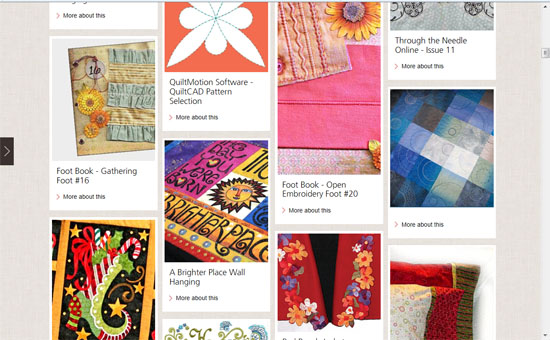



First impression of the new website is that it’s not very user friendly. The old one had everything in plain sight to click on. I couldn’t figure out where to go to watch a video on my walking foot, and ended up finding one on UTUBE by a store owner, but not by Bernina USA. I’ve just gotten my daughter a new Bernina, and it might be a little overwhelming to her.
Thanks for listening.