Contrasting Colors Patchwork Blocks
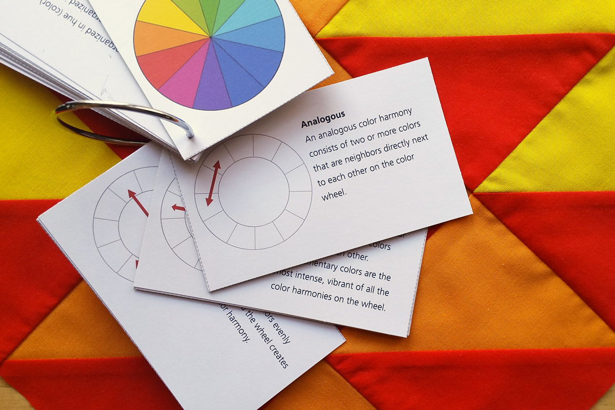
Welcome to another installment of our series on Color Theory! In the first two posts we took a closer look at the Color Wheel, and discovered the basics of Color Harmony. Today’s post is all about how colors can play with each other, and play tricks with your color perception.
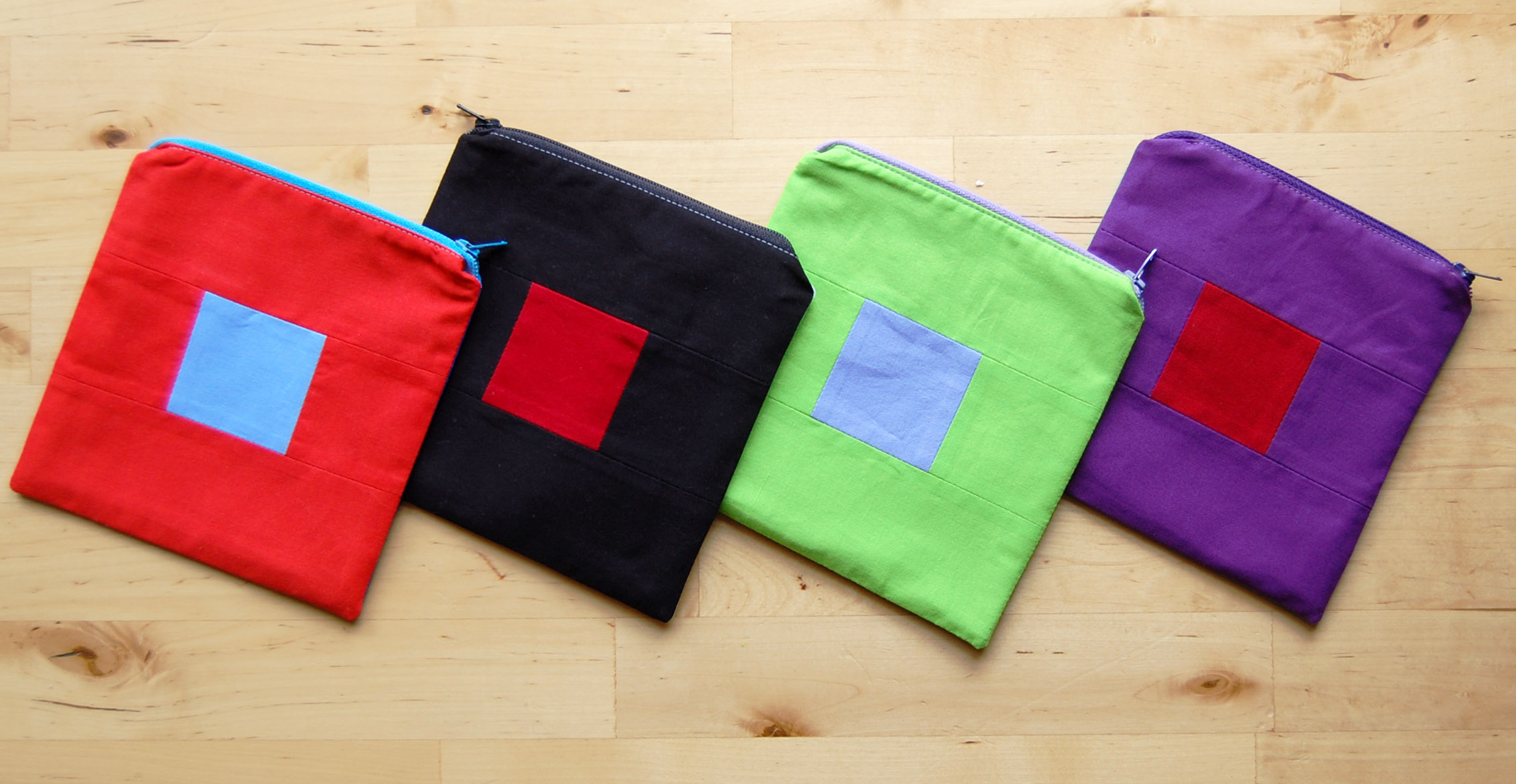
Here’s an example of colors playing games. Take a look at the two patchwork blocks below (scroll down to learn how to make your own Contrasting Colors Patchwork Blocks just like these).
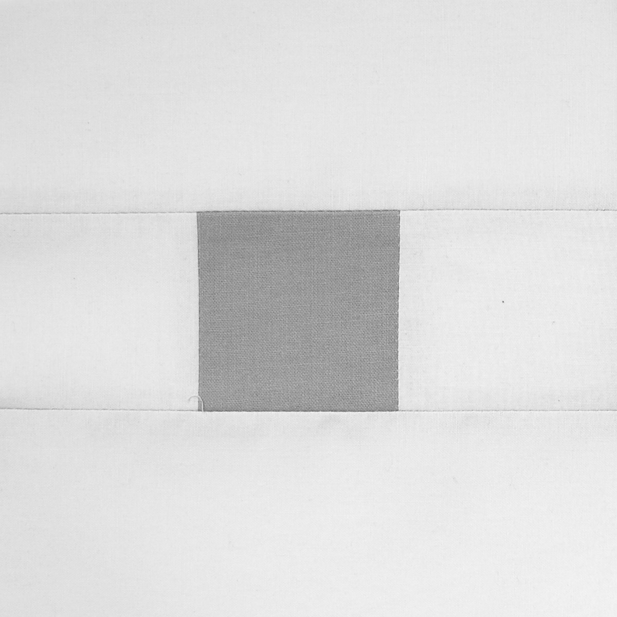
This block appears to be a dark gray square in a light gray square.

And this block appears to be a light gray square in a dark gray square. Which of the two smaller squares in these blocks is the lightest? And which is the darkest?
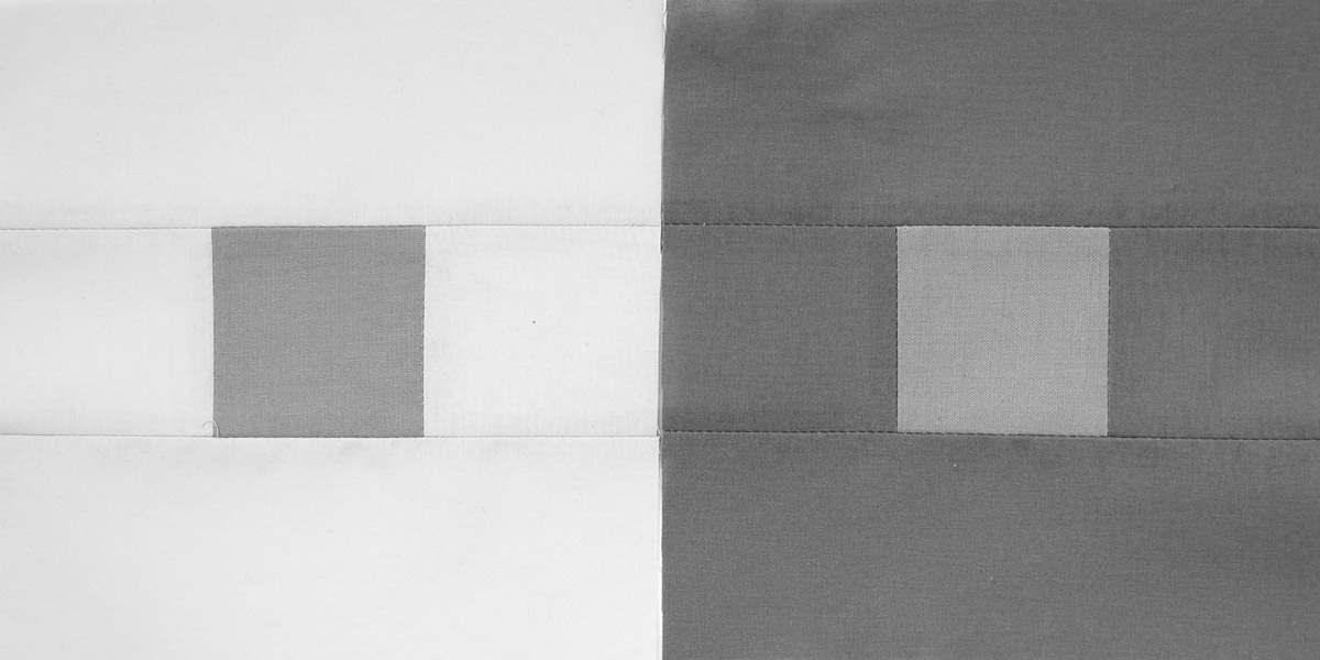
Would you believe both small squares are exactly the same color gray?

Here’s another one. This block has a center square that appears to be a deep, dark red.
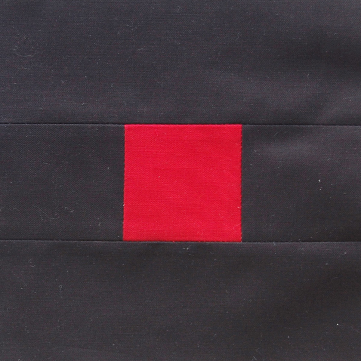
This center square appears to be a vibrant, glowing red.
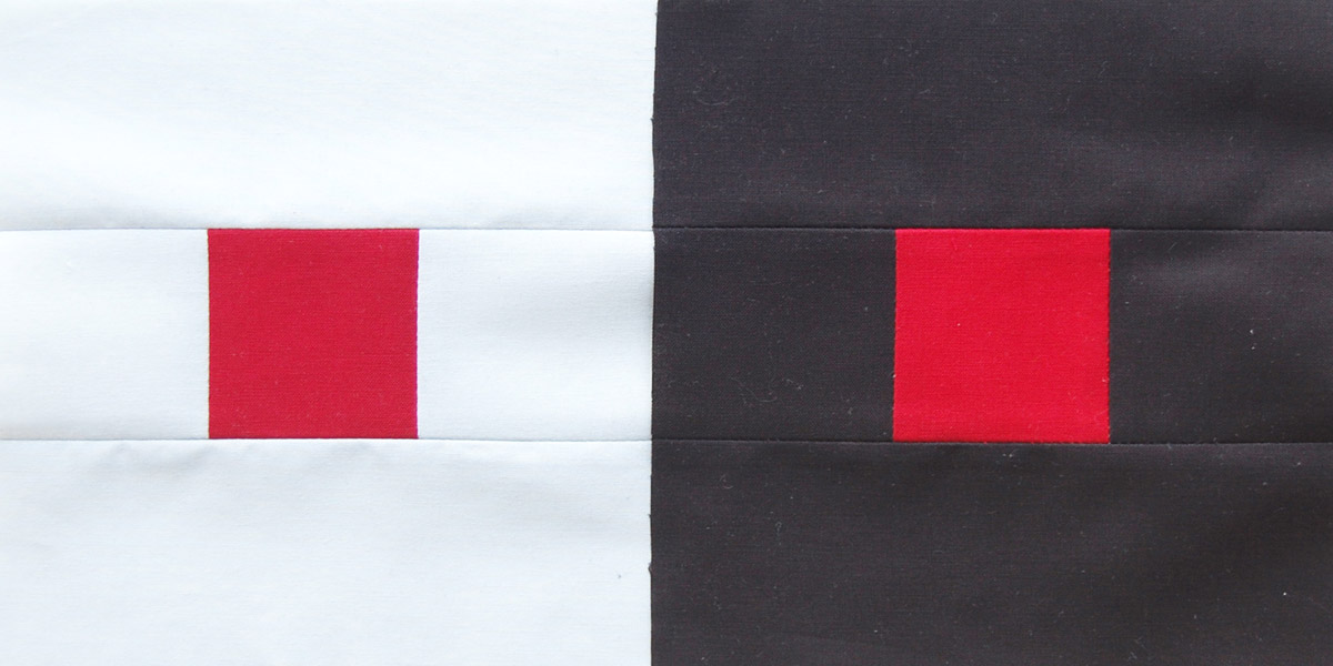
Again, the red is the same color in both patchwork squares!
What kind of tricks are these colors playing with your eyes? When you look at these patchwork blocks you don’t only see the center square, but the larger view surrounding the square. It is our perception of these colors seen together, simultaneously, that causes the optical illusion. This illusion of colors appearing to change in juxtaposition with each other is called Simultaneous Contrast.

The term simultaneous contrast was coined by an unlikely color theorist, French chemist Michel Eugène Chevreul (1786-1889). Because Chevreul studied the chemistry of natural dyes early in his career, he was appointed Director of Dyes at the Royal Gobelins tapestry factory in Paris. He spent many, many years experimenting with how colors interact together, and published his findings in his 1839 masterwork on color, The Principles of Harmony and Contrast of Colors. His book was important in first identifying the principles of simultaneous contrast, and became influential to artists for many generations.

About a century after Chevreul’s book was published, artist and Educator Josef Albers (1888-1976) created a different way of learning about simultaneous contrast while teaching at the Bauhaus. Albers approach was directly hands-on, urging his students to experiment with color interaction through using colored papers. He published an overview of his methods in the influential book Interaction of Color, first published in 1963. Albers book explains in simple terms how simultaneous contrast can make one color look like two (like the picture above), or how color interaction can even make two different colors look like one. You can see the strong influence of Albers on quilters like Heather Jones, Jacquie Gering, and Callie Works-Leary.
We can understand the basic rules about how colors play with each other (and our color perception) from both Chevreul and Albers.
The Principles of Color Contrasts
Now we know that colors can interact and appear to change. This change in the appearance of color can occur in one or both colors, it can be subtle, or it can be very apparent.
Contrast of Value

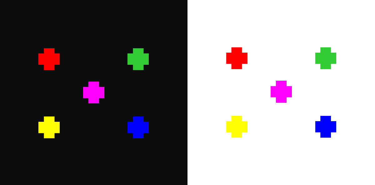
The first principle of color contrasts is of value (light and dark contrast). The gray scale above shows how we can perceive one solid, middle toned gray as light or dark depending on the background.

The same principle applies to the green stripe on a background of various blue values.
Therefore, a color will appear lighter on a dark background, and darker on a light background.
Contrast of Complements

The principle of contrasting complements is based on the high intensity relationship between complementary colors (read more about color complements here). In the above illustration, the green appears more intense and bright on the red background than on the gray background.
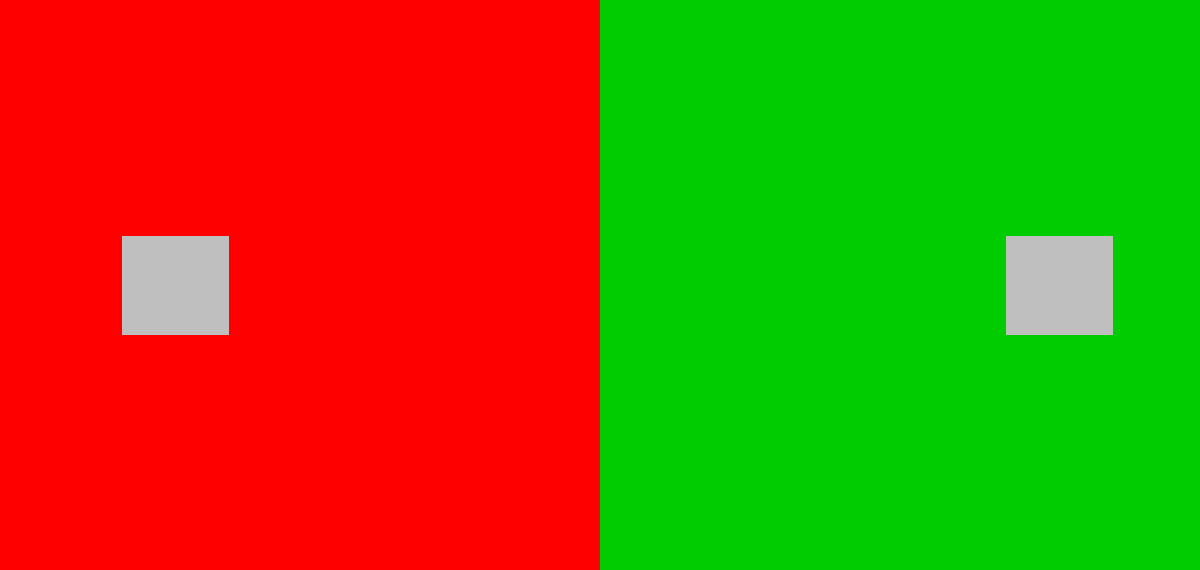
Very strong colors can also push neutral colors to appear more like their complements. The small gray square may appear more greenish on the red background, and more reddish on the green background.
The force is strong with complementary colors! So strong that complements can make each other look more vibrant, and create the appearance of colors that aren’t really there.
Contrast of Subtraction

In the illustration above, a blue-violet square is placed on a blue background and a violet background. The square seems to appear more violet on the blue background, and more blue on the violet background. The larger areas of color seem to take away some of the same color from the small square. This is what is meant by the contrast of subtraction.
Contrast of Intensity
Colors that are fully saturated (a true color with no white, black, or gray added) appear brighter and much more vibrant on a black background. Saturated colors lose some intensity and appear darker on a white background. And these colors will change again when placed on a gray background!
Want to play around with contrasting colors, or maybe test out some ideas for your next quilt? Here’s how to make some simple patchwork blocks like the samples above.
Materials to Make a Contrasting Colors Patchwork Block
Blocks are 6.5″ x 6.5″
- Scraps of fabrics in various solid colors; one contrasting color and two different main background colors
- Coordinating thread
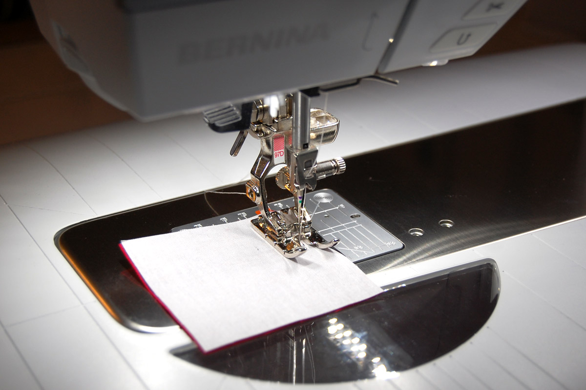
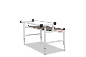
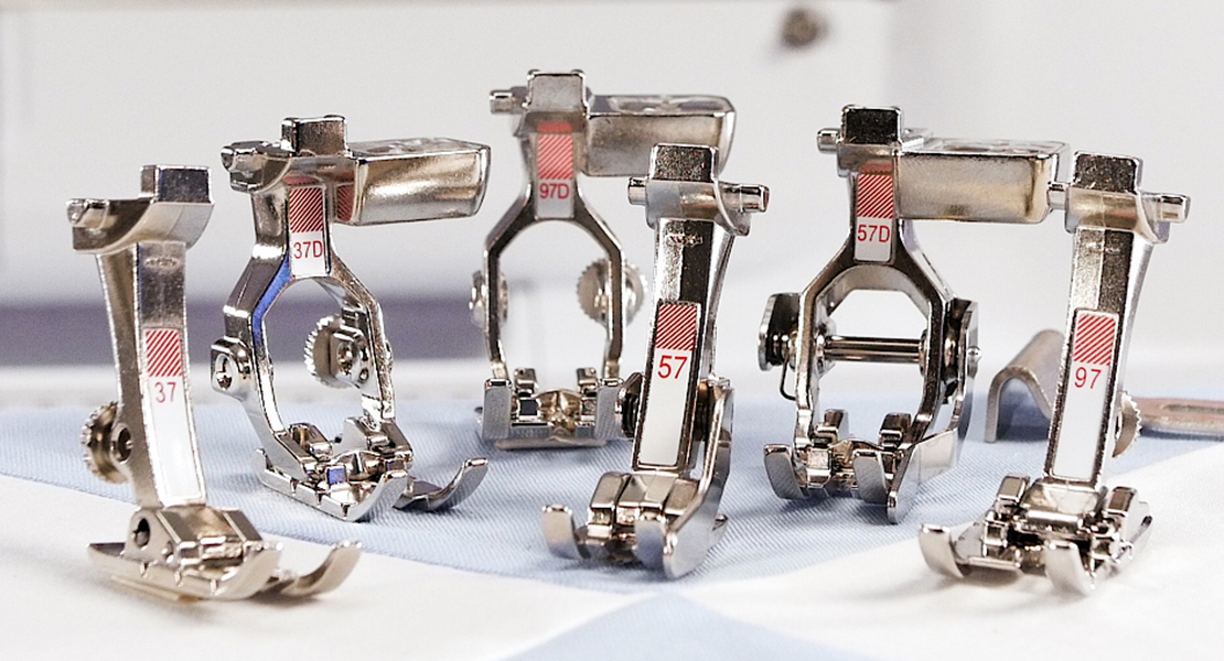
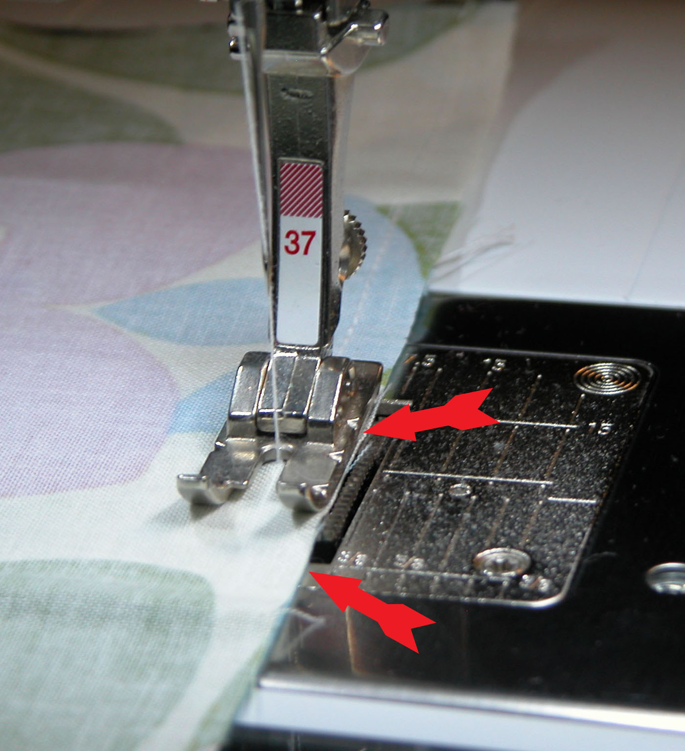
- Sewing machine (I use a BERNINA 770 QE)
- Straight stitch needle plate
- Patchwork foot of your choice (I use a Patchwork foot #97D)
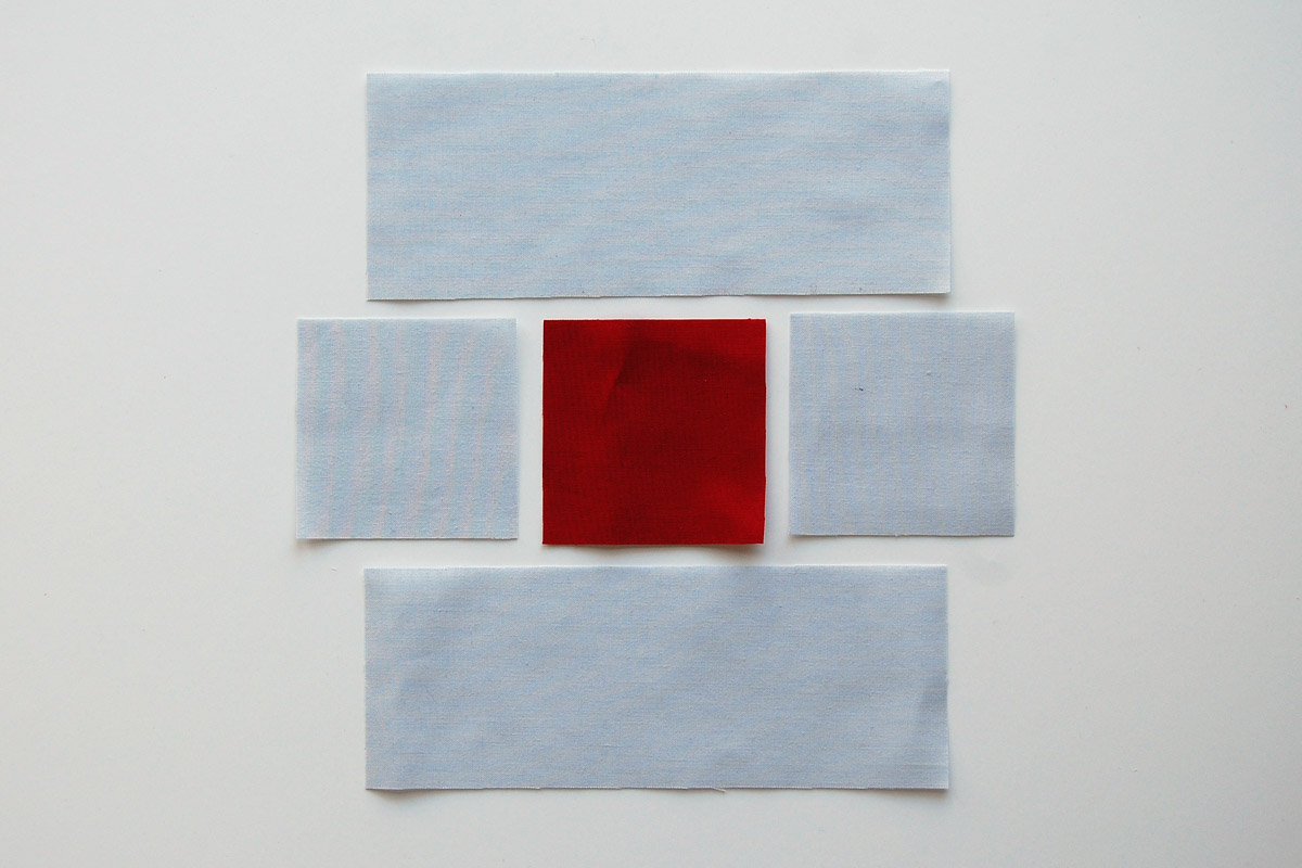
For each block cut two rectangles from the main fabric 6.5″ x 2.5″, two squares 2.5″ x 2.5″, and cut from a contrasting color one 2.5″ x 2.5″ square.
Set up your sewing machine with a straight stitch needle plate and a Patchwork foot of your choice. I sew with a BERNINA 770 QE and am using the Patchwork foot #97D.
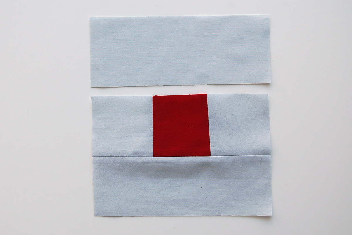
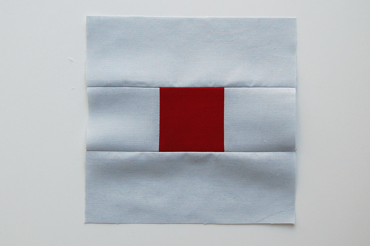
Sew the two main squares to each side of the contrasting color square using a 1/4″ seam. Press seams open.
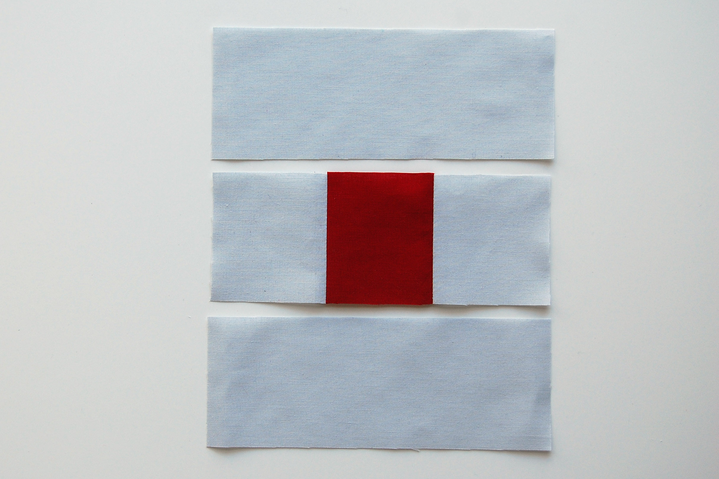
Next, sew one of the main background fabric rectangles to the block with a 1/4″ seam. Press seams open.
And finally, sew the remaining main background fabric rectangle with a 1/4″ seam. Press seams open.
Sew one more block using the same center color with a different main background color.
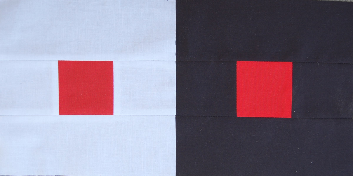
Place the blocks side-by-side. Are your eyes playing tricks on you? Share your blocks with us on Instagram by tagging @berninausa, @erika.mulvenna, and use #contrastingblocks in your post!
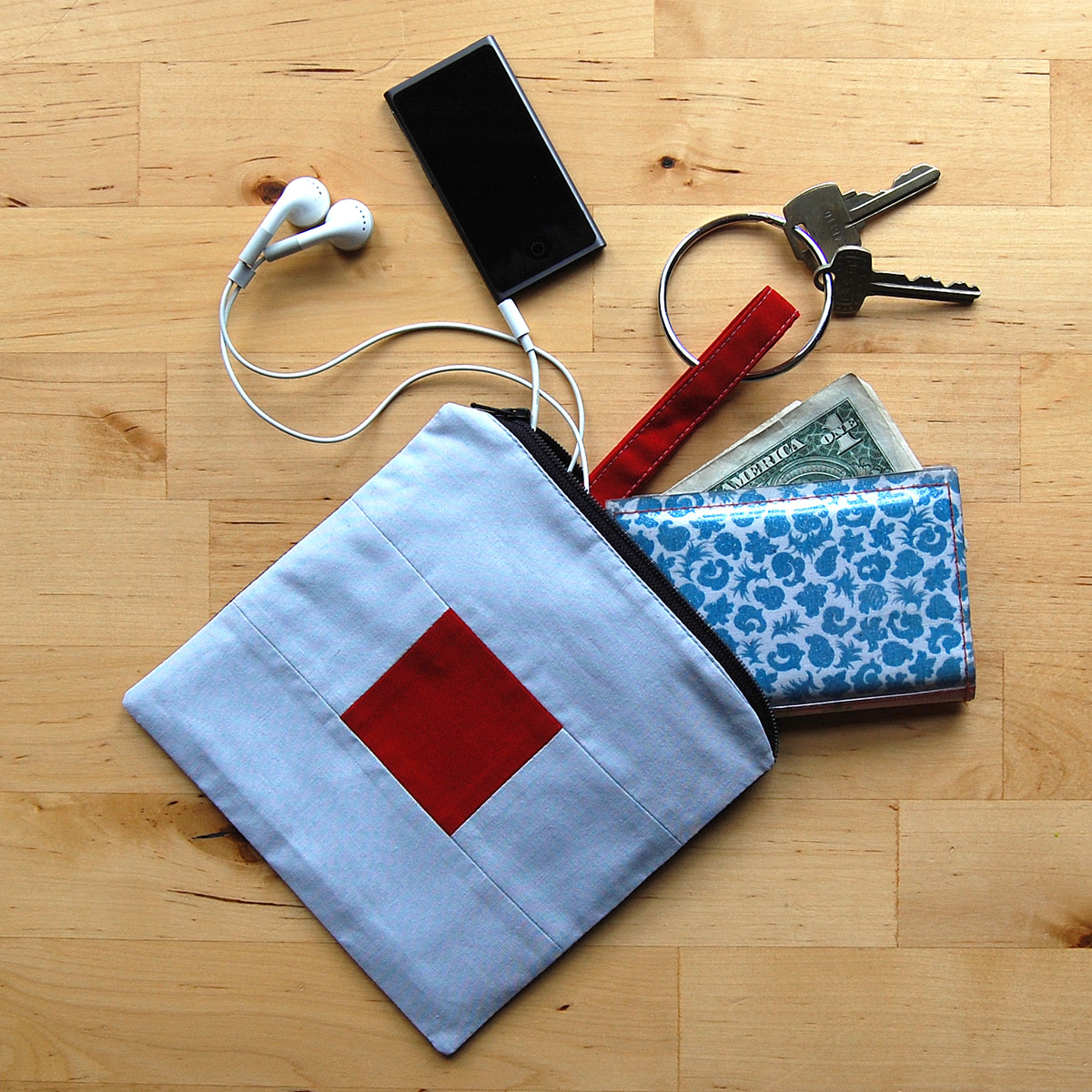
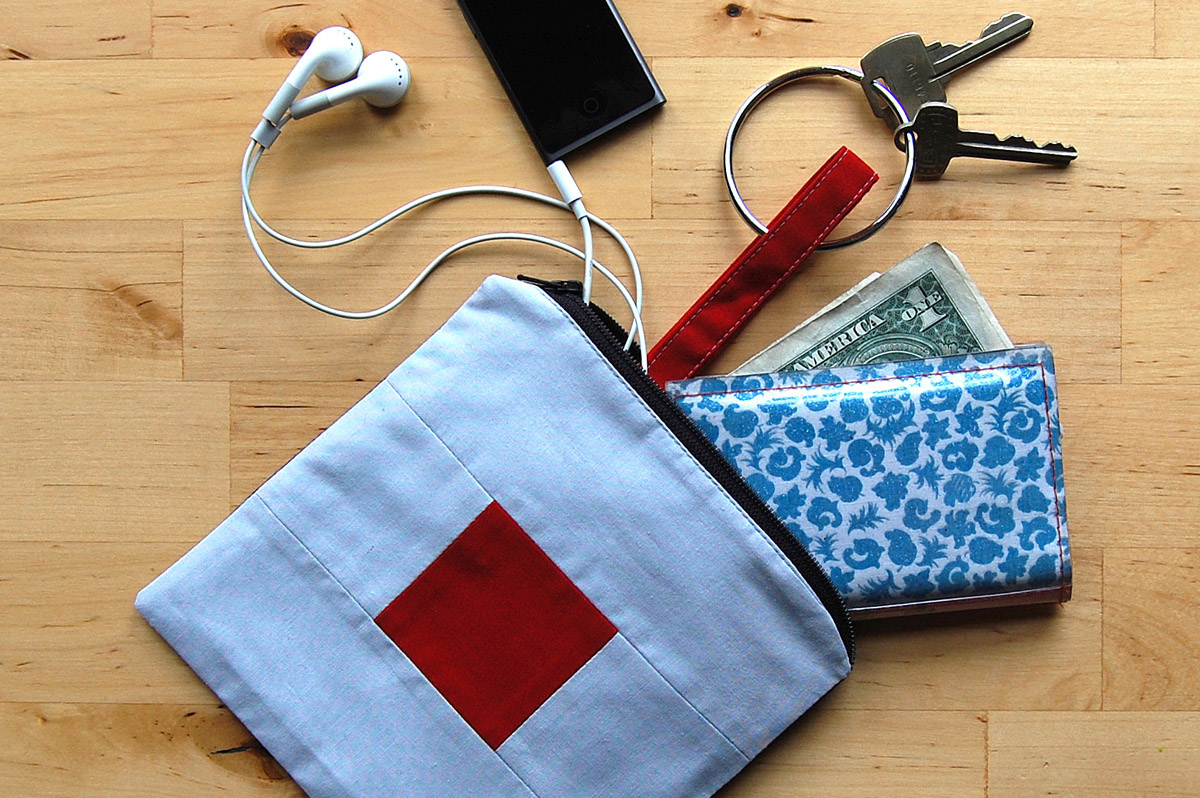
As a bonus, I’ll show you how to turn your Contrasting Colors Patchwork blocks into a handy zipper pouch! Click to find the Color Block Zipper Pouch tutorial at WeAllSew.


What you might also like
8 comments on “Contrasting Colors Patchwork Blocks”
-
-
I’m so glad that you’re interested in the posts. I think the biggest challenge is exactly what you mention, writing about the interesting parts of color theory without making it overwhelming. Best – Erika
-
-
This is the best explanation about color theory I’ve seen. I too get overwhelmed when trying to understand color and how it affects our quilting. Thank you so much. Am looking forward to more. Can I use this at my quilt guild meeting? A lot of people there could benefit. Of course, all credits will go to you.
-
Hi susanp, I am so glad that you are following the color theory series! Yes, of course you can share with your quilt guild, I hope your guild mates enjoy the material. Best – Erika
-
-
Are my eyes playing tricks on me? Some of the blocks with center squares look bigger or smaller than their partner blocks. Is this another optical illusion? I know the images are the same size, but for instance, the orange center square on the orange block “looks” larger than the orange center square on the blue block. I seem to remember learning in Home Ec class that colors can influence perception of size, such as navy making a person look slimmer. I wondered if this is related?
-
Yes, you may be right! It is true that our perception of objects is affected by color, but I think darker objects are supposed to appear smaller than lighter objects? I’d have to look it up, but it does go to show that sometimes our perception of the world around us isn’t quite what it seems! Cheers – Erika
-
-
I just joined and I’m looking for the two previous lessons in this color theory class. Can you direct me to them? I’ve always wanted to study exactly what this course seems to cover. Thank You.
-
Hello mamabunny, and thanks for joining WeAllSew! You can find links to the first two Color Theory posts in this series linked in the first sentence of this post. The first post is all about the color wheel, and the second is about finding harmonious color combinations using a color wheel. I hope you enjoy the series! – Erika
-
Leave a Reply
You must be logged in to post a comment.
Thank you Erica,
I’m loving learning about color! I’ve tried before but got overwhelmed I think. But you are making it so interesting. I love learning the history of it. Thank you so much!
Sandra