How to Use a Color Wheel
Playing with a color wheel is a great way to learn about personal color preferences and discover new ways to combine colors. In last week’s post, Color Wheel Basics, we learned what a color wheel is and the three most used color systems. This week you will learn how to find harmony in any color wheel.
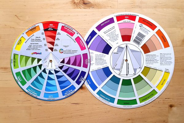
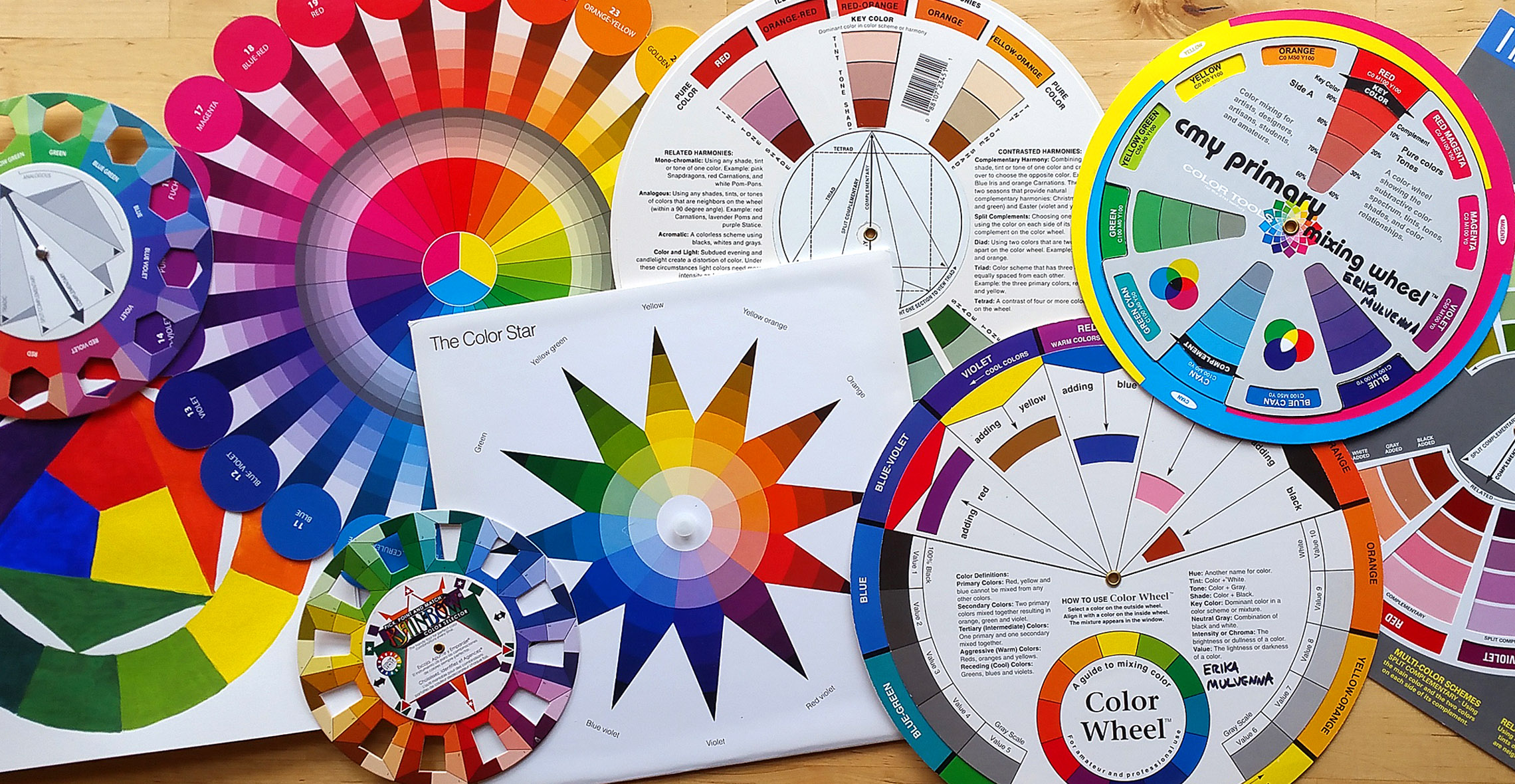
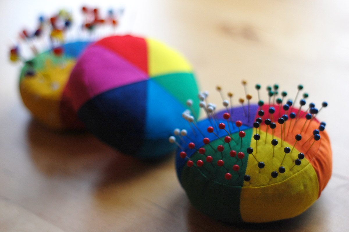
If you like the idea of playing around with a color wheel, I recommend picking up one (or both) of the wheels pictured above. They include all of the basic color harmonies we’re looking at today—right on the wheel. The wheel on the left is a CMY (cyan, magenta, yellow) color wheel, and on the right is an RYB (red, yellow, blue) color wheel; I use both of these wheels often! Check in with your local fabric or art supply store and ask if they carry either of these color wheels. Although I have not yet found an RGB (red, green, blue) color wheel in the format like these, you can find similar colors on the CMY wheel.
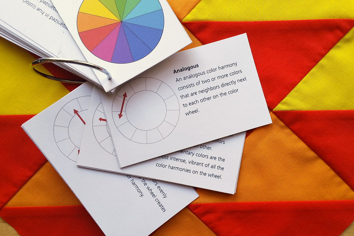
As a bonus, at the end of this post you’ll find free PDF printable Color Harmony cards that can be used along with ANY color wheel! Find the download and instructions for putting together your Color Harmony card set at the bottom of the post.
How to Make Color Harmony Samples
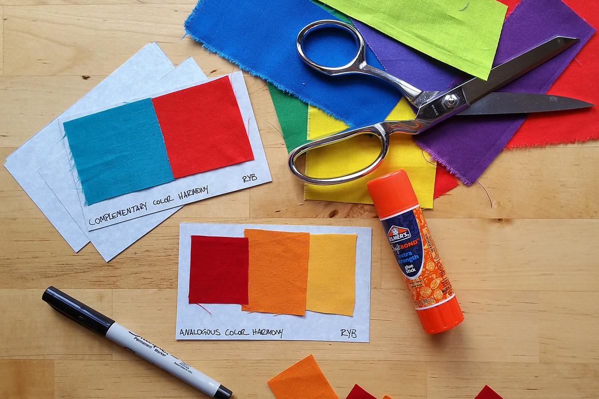
You don’t need to make color harmony samples to use a color wheel or get inspired to try new color combinations. But it is a good way to dig in and start exploring color relationships and can help you find combinations that you really like. Solid colored fabrics make it simpler to see how a color harmony looks than using prints with various colors or large designs. If you can master pulling together a color harmony from solids, you will find it much easier to move on to creating similar combinations with prints.
If you’d like to create color harmony samples on index cards, the first step is to decide which color system you will use. You can pull fabrics from your stash, or shop for solid colors that will most closely match the 12 basic hues in your color wheel. Identify a color harmony, find the colors on your wheel, and cut swatches to match. Use a glue stick to attach the swatches to an index card or paper; you can then label the sample with the name of the harmony for future reference. By the way, this is a really fun exercise to do with friends or in a big group—especially to bring all your colorful fabric scraps and share!
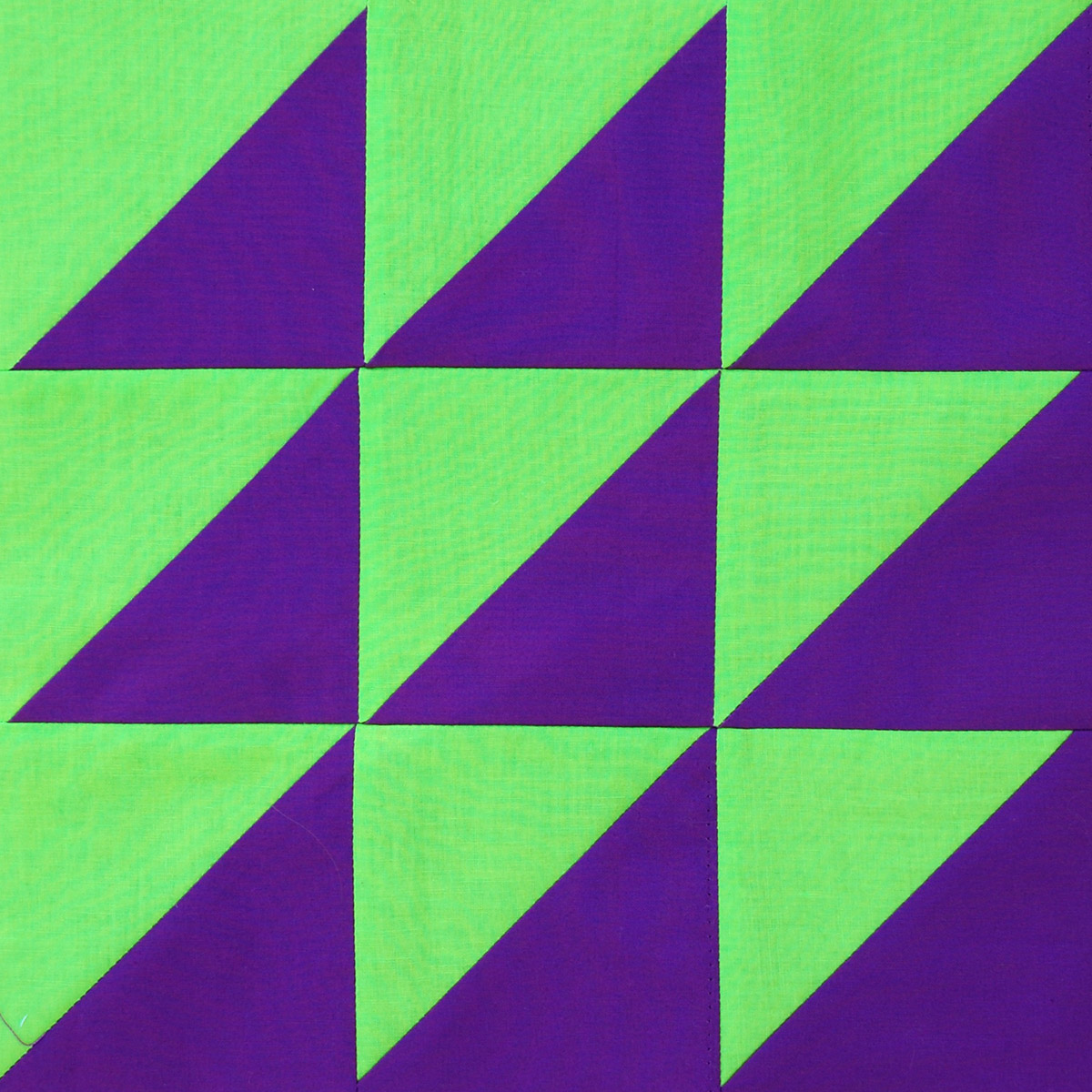
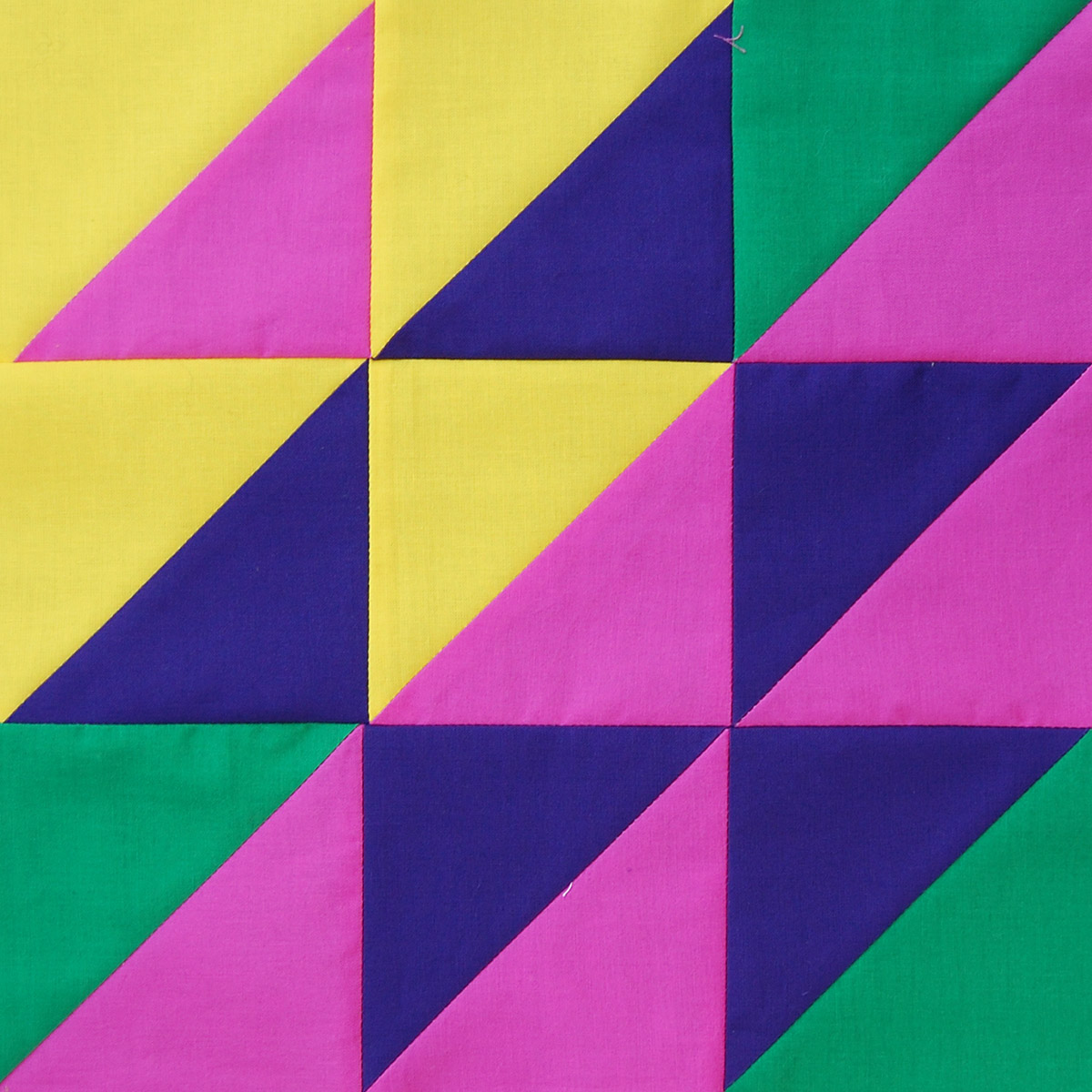
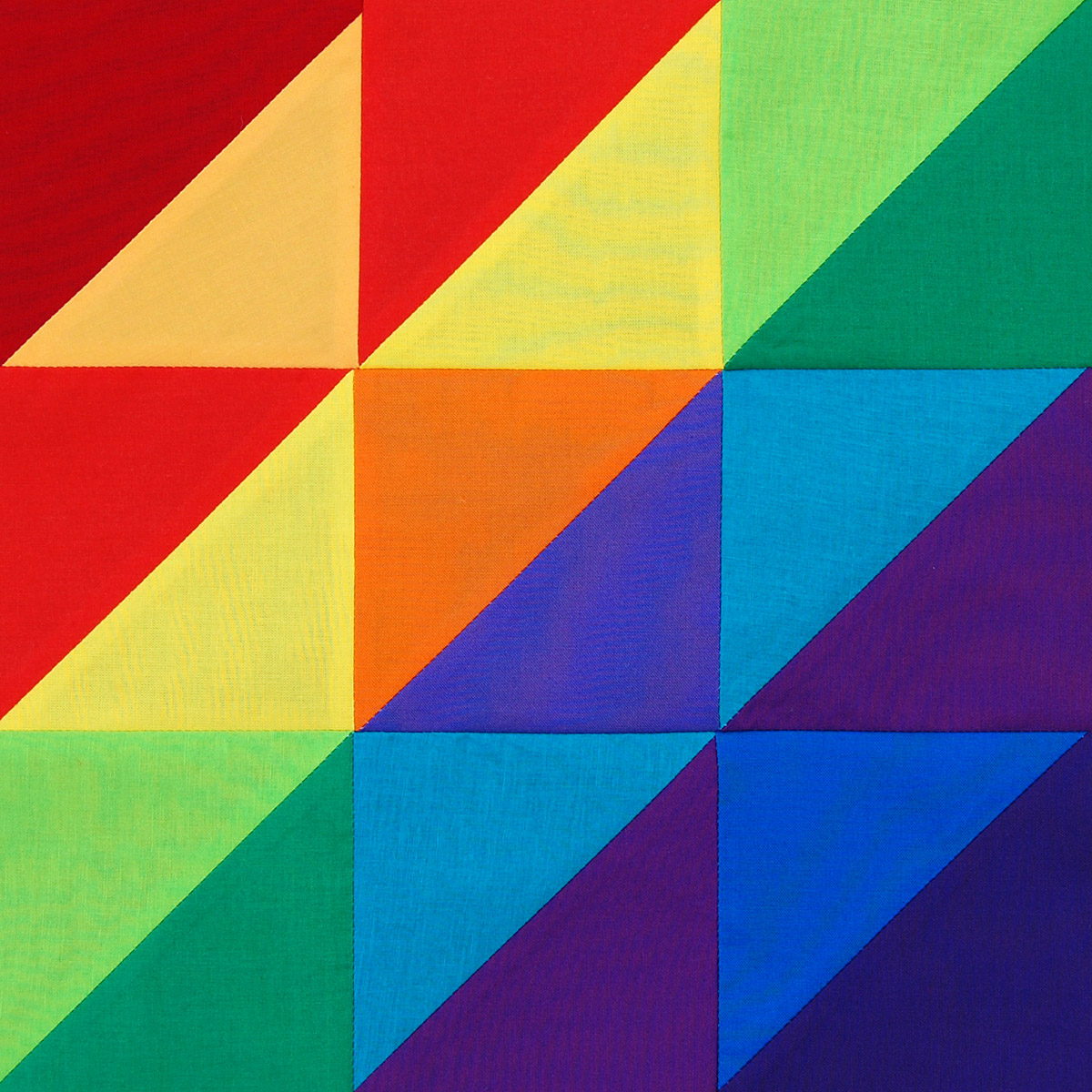
You may also want to experiment with color harmony samples in patchwork blocks. I created the patchwork samples in this post using half square triangles arranged in a 9 patch block. I used the CMY color wheel and gathered together solid colored fabrics matching the hues in the wheel (plus some black, white, and different grays). I picked a specific harmony from the wheel, and found the colored fabrics to match. Using the fabrics in about equal proportions, I cut 5″ squares of fabrics to make half square triangle blocks using this method. Then I played around by laying out 9 of the finished half square triangle blocks until I liked the composition, and stitched them together.
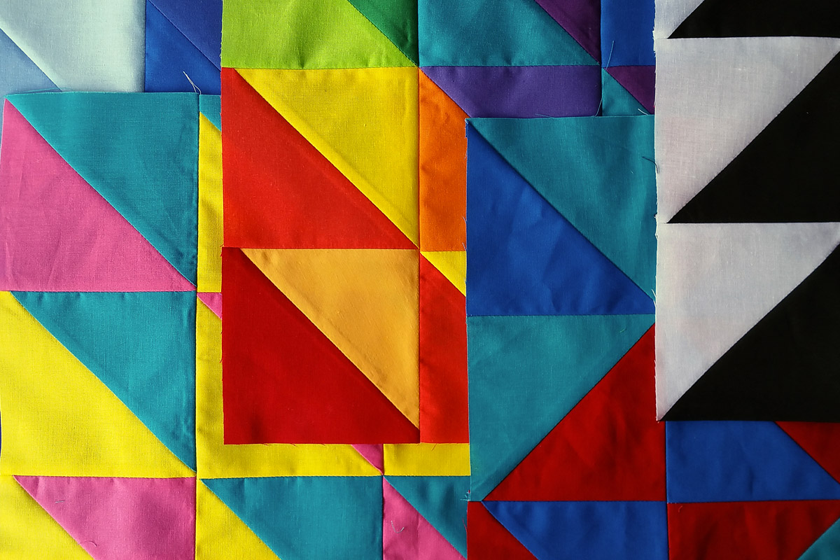
There are other simple quilt blocks that would work equally well for making color sample blocks; simple square patchwork in a grid, a 9 patch, rail fence, strips, you get the idea. Any block will work that will allow you to put together a harmony with the colors in about equal proportions.
How to use a Color Wheel
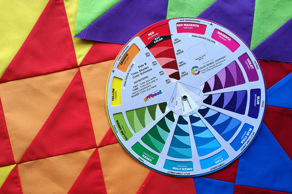
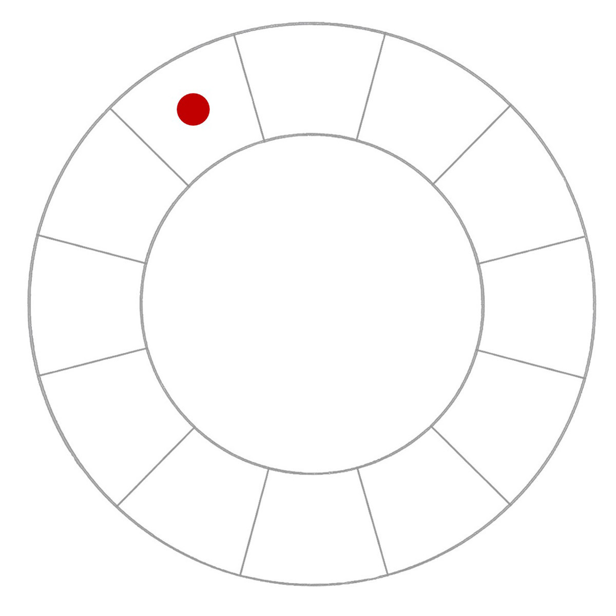
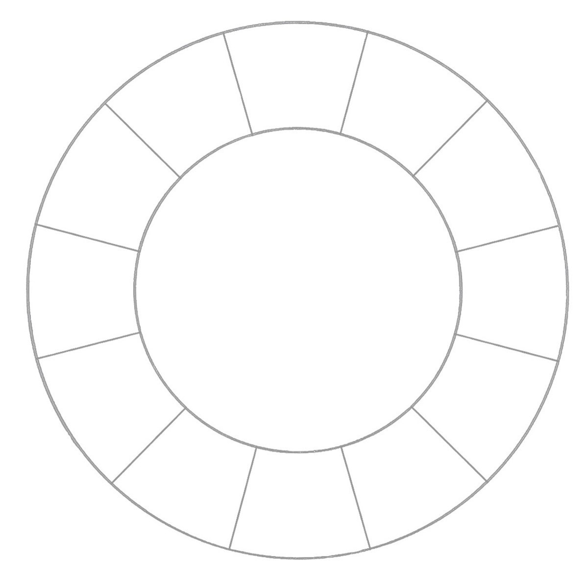
Once all the colors in a system are displayed in a wheel, you can see simple relationships between the colors. The illustrations below show how each basic color harmony can be found on a blank wheel. You can identify the harmonies on either the RYB, RGB, or CMY color wheels..
Monochromatic Color Harmony
A monochromatic color harmony uses just one color from the wheel in different tints, tones and shades. A tint is any hue mixed with white, a tone is any hue mixed with gray, and a shade is any hue mixed with black.
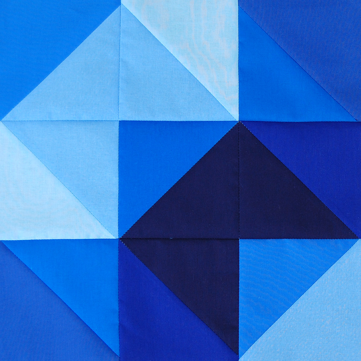
A monochromatic color combination takes on the overall personality of the color you choose. For instance, this color combination takes on a cool, quiet, and calming feeling—the major attributes of the color blue. This is a great color harmony to use in order to set a specific mood using color.
Analogous Color Harmony
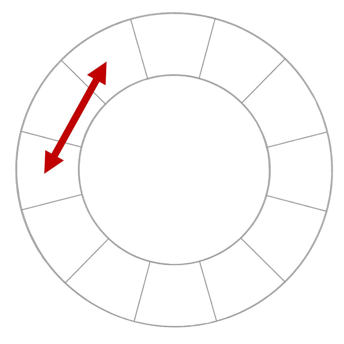
An analogous color harmony uses two or more colors that are next to each other on the wheel. An analogous color harmony can be two neighbors, or include three or four color neighbors.
Analogous combinations give different results depending on the colors you choose. In this sample, these three colors are neighbors on the warm side of the color wheel. They feel very vibrant and stimulating—representing the major attributes of the red/orange colors. This combination would have a different look if cool colors were selected, or even if the combination included a mix of warm and cool colors. Many people find an analogous combination very pleasing because the colors almost always blend together well.
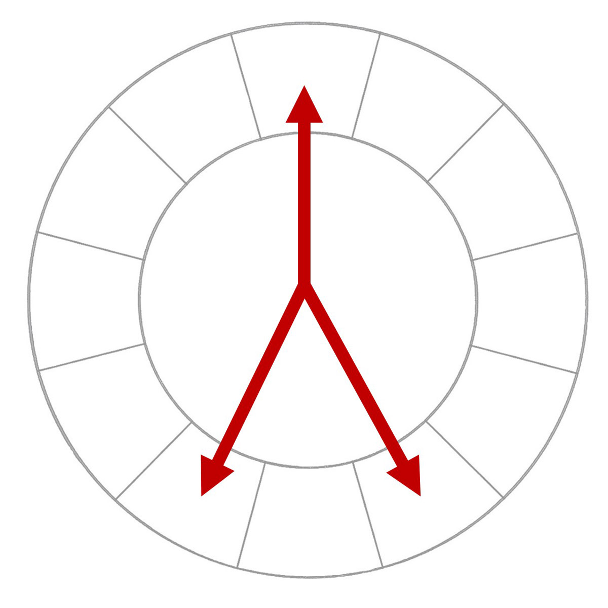
Diad Color Harmony
A diad color harmony combines two colors that are spaced one color apart from each other on the wheel.
This harmony offers a bit more contrast than an analogous pair of colors because they are not direct neighbors. This blue/violet combination takes on the personality of these cool colors; choosing a different pair on the warm side of the wheel will give totally different results. This harmony is a great way to pair two colors that will almost always blend together well.
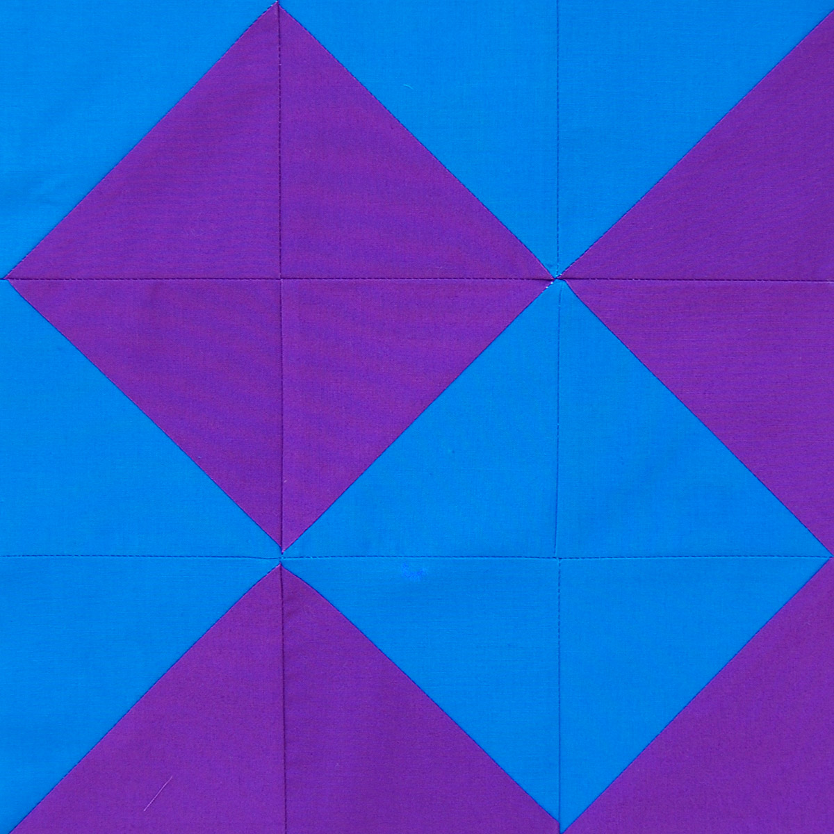
Complementary Color Harmony
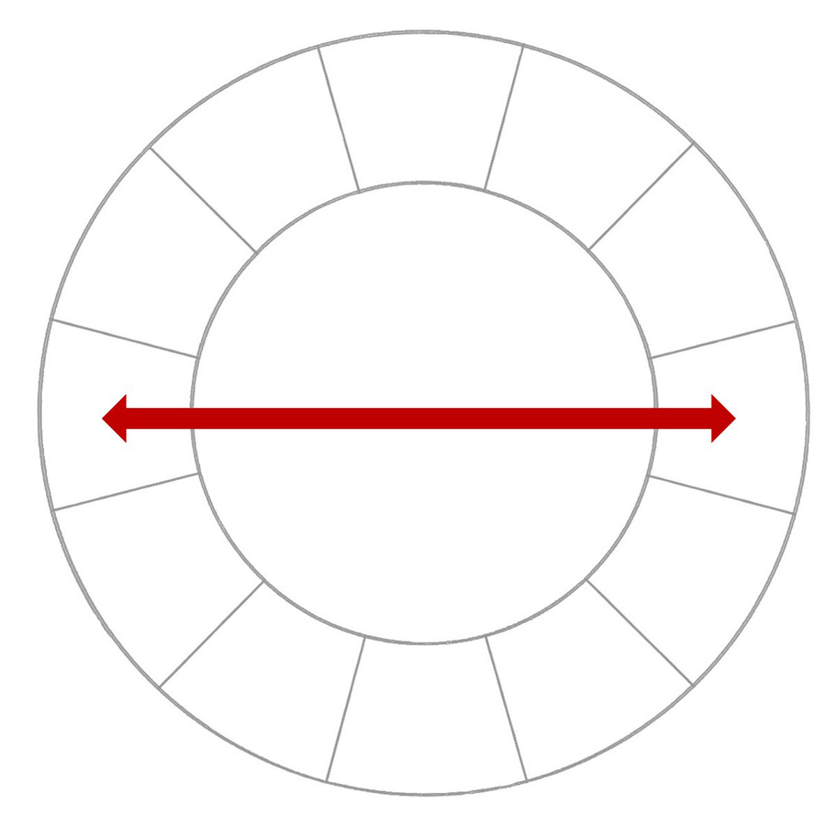
The complementary color pairs are the most intense and interesting combination on the wheel. Any pair of colors directly across from each other on the wheel are color complements, as both colors “complete” or “cancel” each other out. In the RYB system, mixing pigments in complementary pairs results in a neutral gray, a muddy color that no longer resembles either of the pair. In the CMY system, mixing inks in complementary pairs results in a dark gray. In the RGB system, mixing colored light in complementary pairs results in white light.
Complementary combinations are the most intense, high contrast, and visually jarring when both colors are used fully saturated! Many people feel that complementary colors are said to “clash” with each other because of this vibrating intensity. To use a complementary pair without the vibrant effect of clashing colors, use one color fully saturated or covering a larger area, and use the other complement muted (in a tint, tone or shade), or in a much smaller area. Looking at all of the complementary pairs around the wheel, you will find some very different and interesting results.
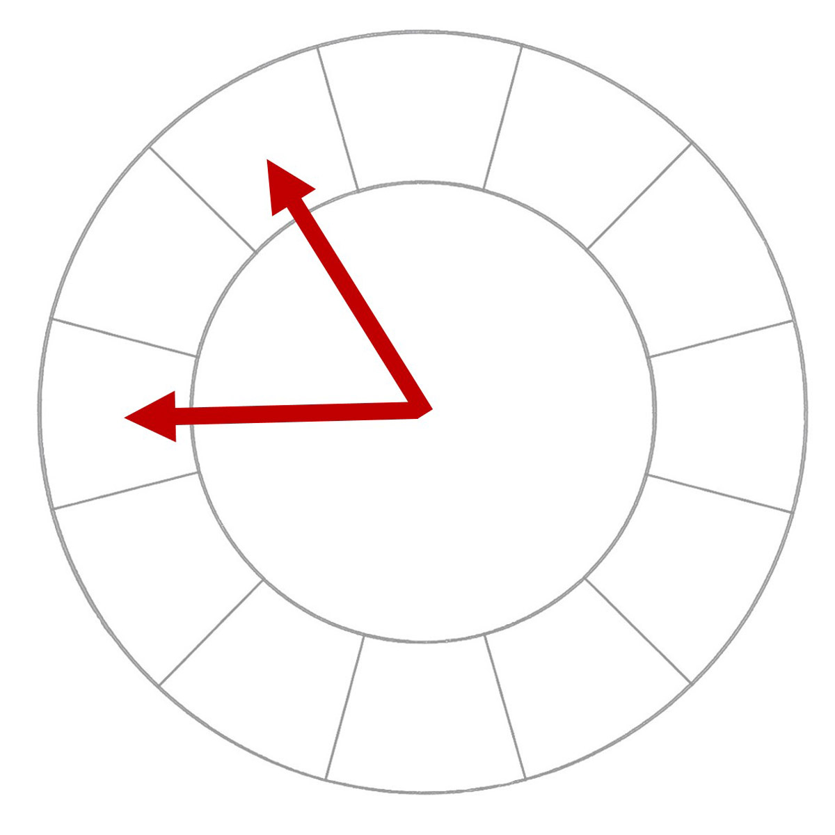
Split Complement Color Harmony
A split complementary harmony begins with one color on the wheel, and includes the two colors on each side of the main color’s complement.

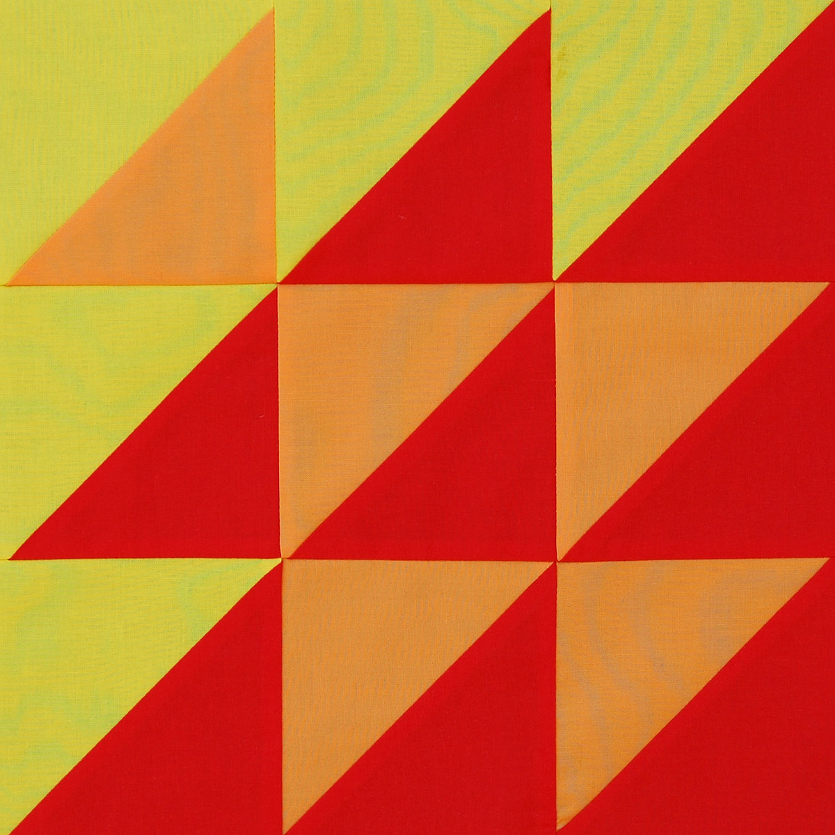
This color combination has similar contrast to a complementary pair, but is less jarring and intense. Red is the main color in this sample, combined with the two colors on each side of red’s complementary pair cyan; blue and green-cyan. The red still pops and creates lots of interest, but overall the combination is not quite as jarring as a pure complementary pair.
Double Complementary Color Harmony
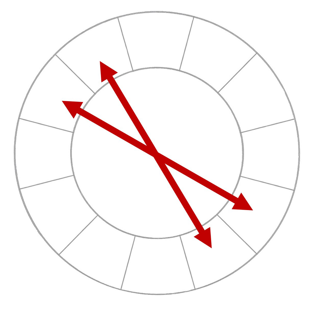
This color harmony includes two complementary pairs from anywhere around the wheel. A double complementary harmony is very colorful and can have many of the vibrant characteristics you would expect to see with complementary pairs.
This color combination may be hard to balance if all four colors are fully saturated. Here are magenta with its complement green, and yellow with its complement blue;, a very bright and intense mix of color. A good way to balance the strong contrasts in a double complementary harmony is to pick one main color, and to look for more subdued tints, tones and shades of the other colors. Another way to balance this color combination is to use one main color in a large area, and keep the three others to a minimum in the design.
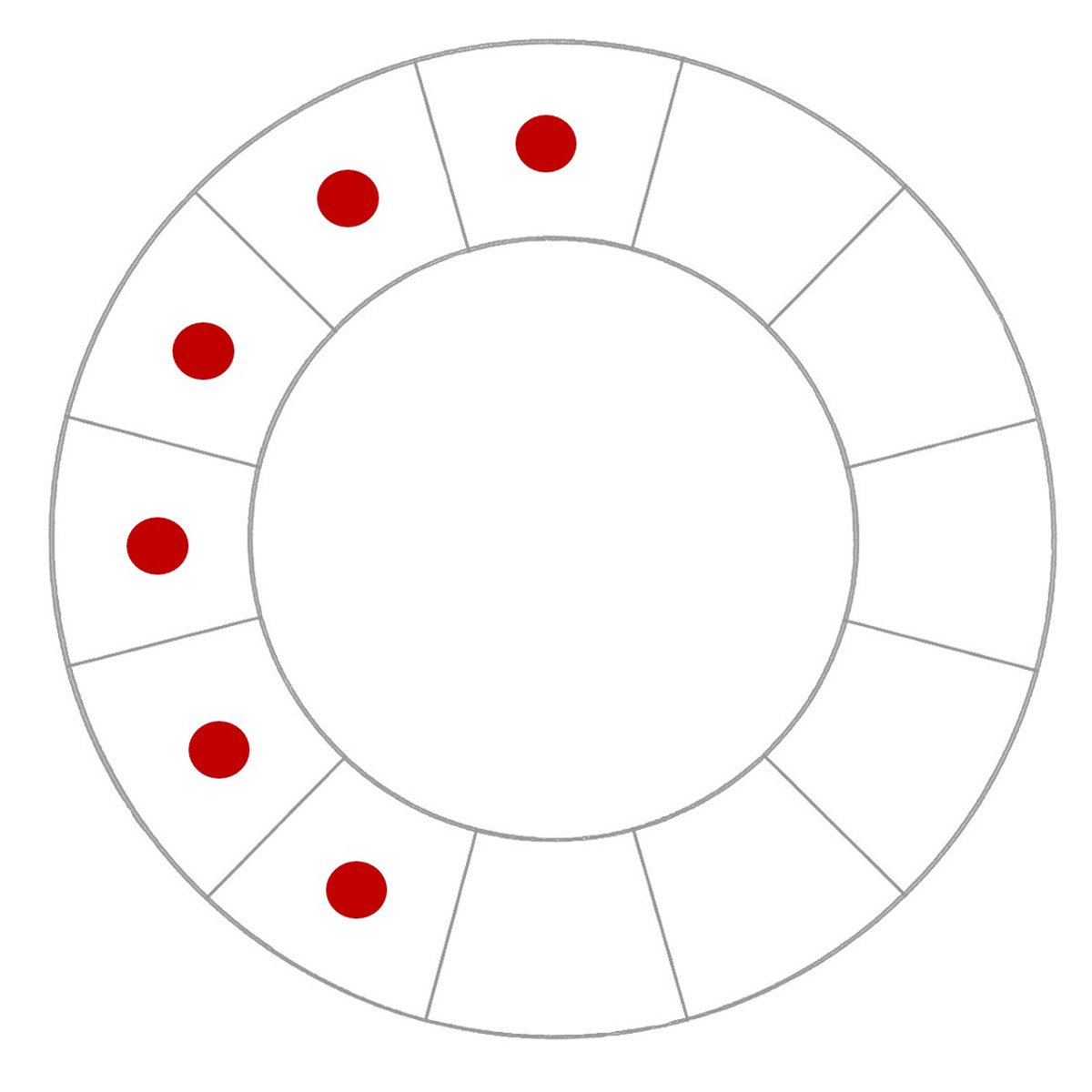
Triadic Color Harmony
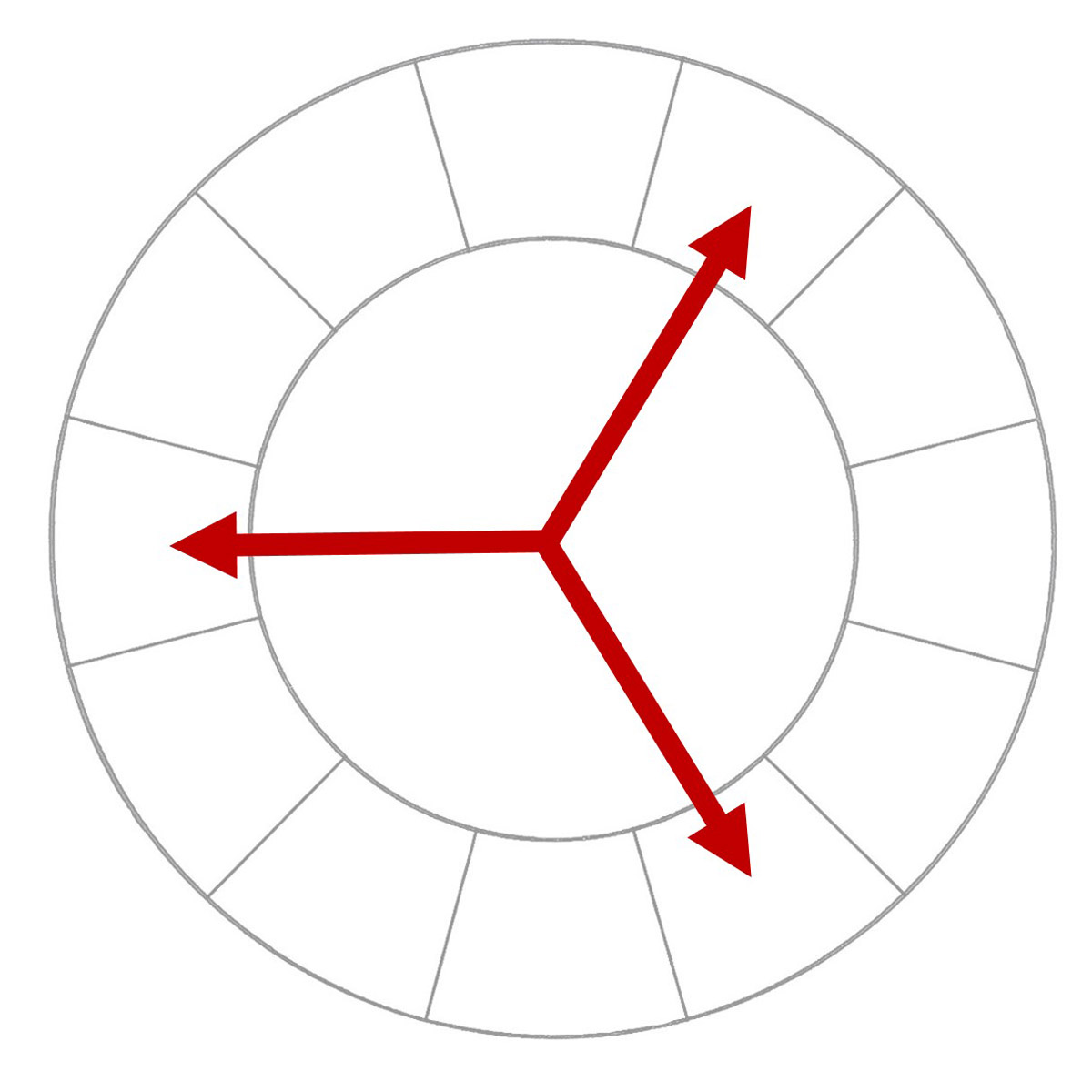
Using a harmony of three colors evenly spaced around the wheel is called a triad. Note that one triad combination will contain the three primaries or parent colors in a system. That also means one triad will contain three secondary colors, and there will be two sets of tertiary triad combinations.
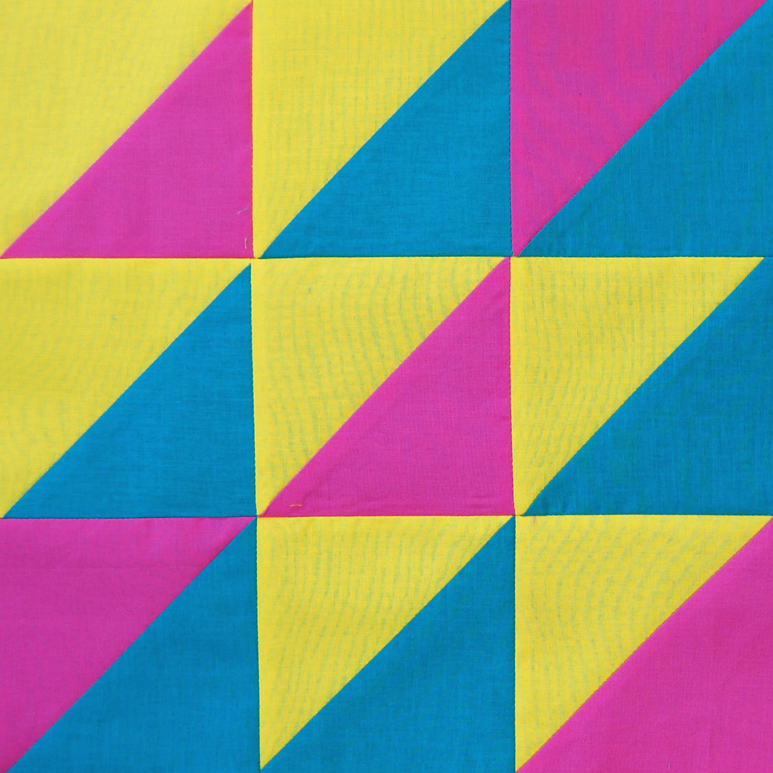
Using a triad of three primary colors can have a very elemental or basic feel. In this combination you see the three primaries of the CMY color wheel; cyan, magenta and yellow. Look around, and you can see many examples of the triadic color harmony used all around you! For instance, the three primaries of the RYB system are used for Superman’s super hero costume—red, yellow and blue.
Tetrad Color Harmony
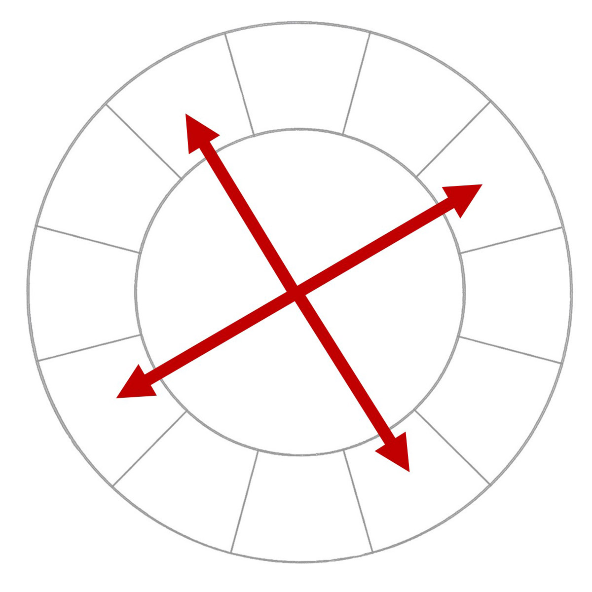
A tetrad color harmony combines four colors evenly spaced around the wheel. Tetrad combinations can form a perfect square as above, or form the shape of a rectangle.
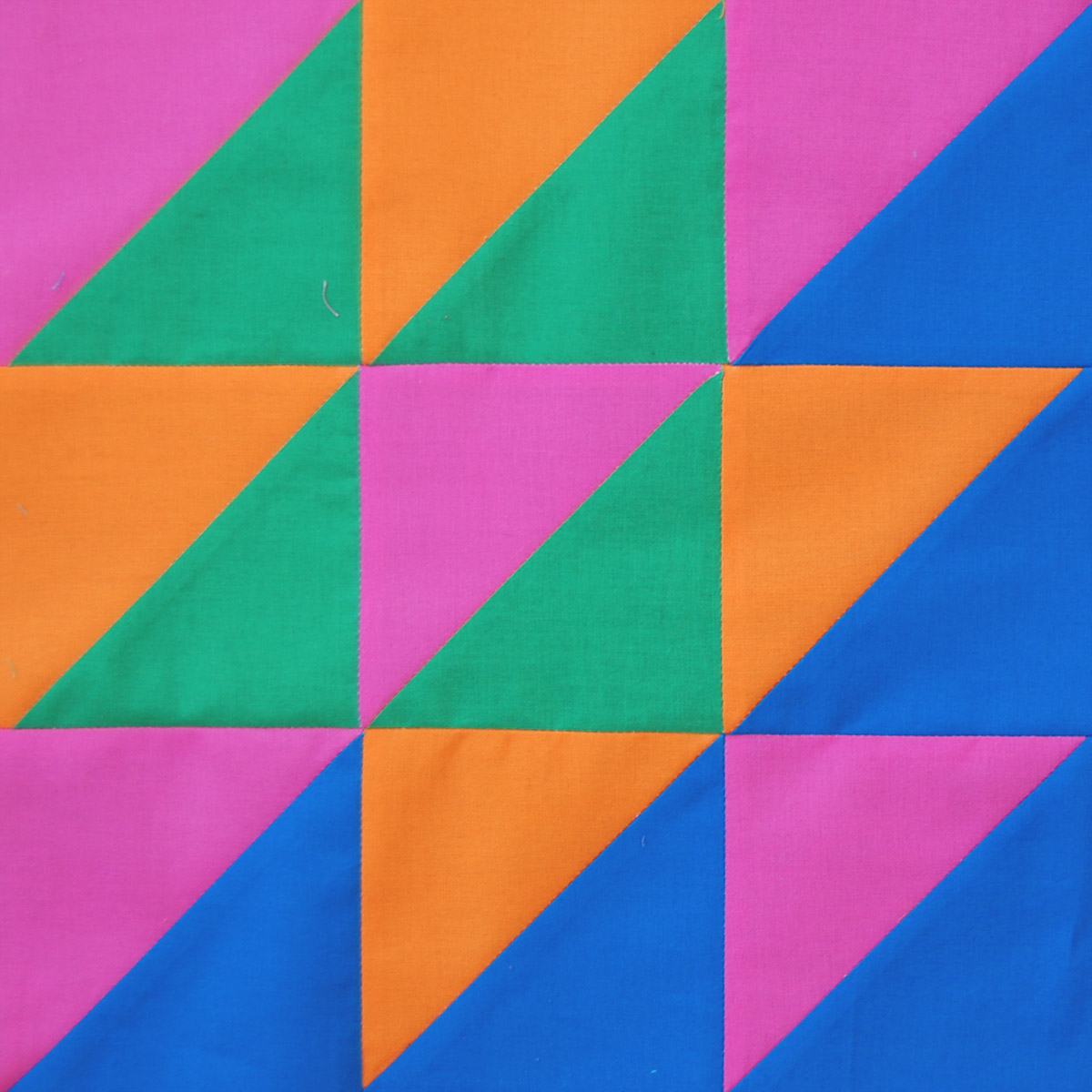
A tetrad combination will always result in two complementary pairs, but does not include color neighbors as in the double complementary color harmony (above). Here you see a blue/orange complementary pair, and a magenta/green complementary pair. These combinations may result in intense, vibrant or jarring combinations when all colors used are at full saturation. You may prefer using one or two of these colors fully saturated, and using muted tints, tones or shades for the remaining colors.
Polychromatic Color Harmony
A polychromatic or multi-color harmony uses a wide variety of colors from all around the wheel.
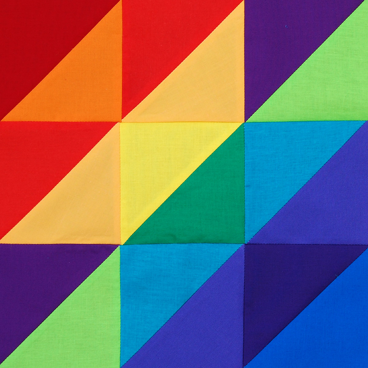
This can be a fun color combination, especially if you use all the colors from one color system. If you saw my Triangles quilt, you may get the idea that a polychromatic harmony is one of my all-time favorites! In fact, I couldn’t stop myself at just one sample, and made two for this harmony.
If you want to give the effect of a rainbow of colors in your project, use a polychromatic color combination with fully saturated colors in about equal proportions. Choosing one main color in your combination and using all the others sparingly or in a muted tint, tone or shade will have the effect of taking on the personality of the main color with all others in a supporting role.
Achromatic Color Harmony
An achromatic color harmony does not include any colors from the wheel at all! This color combination uses only black, white, and/or shades of gray.
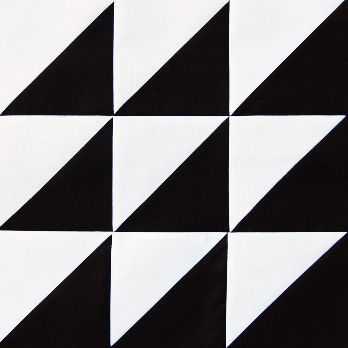
This combination can have stark contrast or feel harsh when restricted to only black and white, or can have more subtle, muted effects when many tones of grays are used.
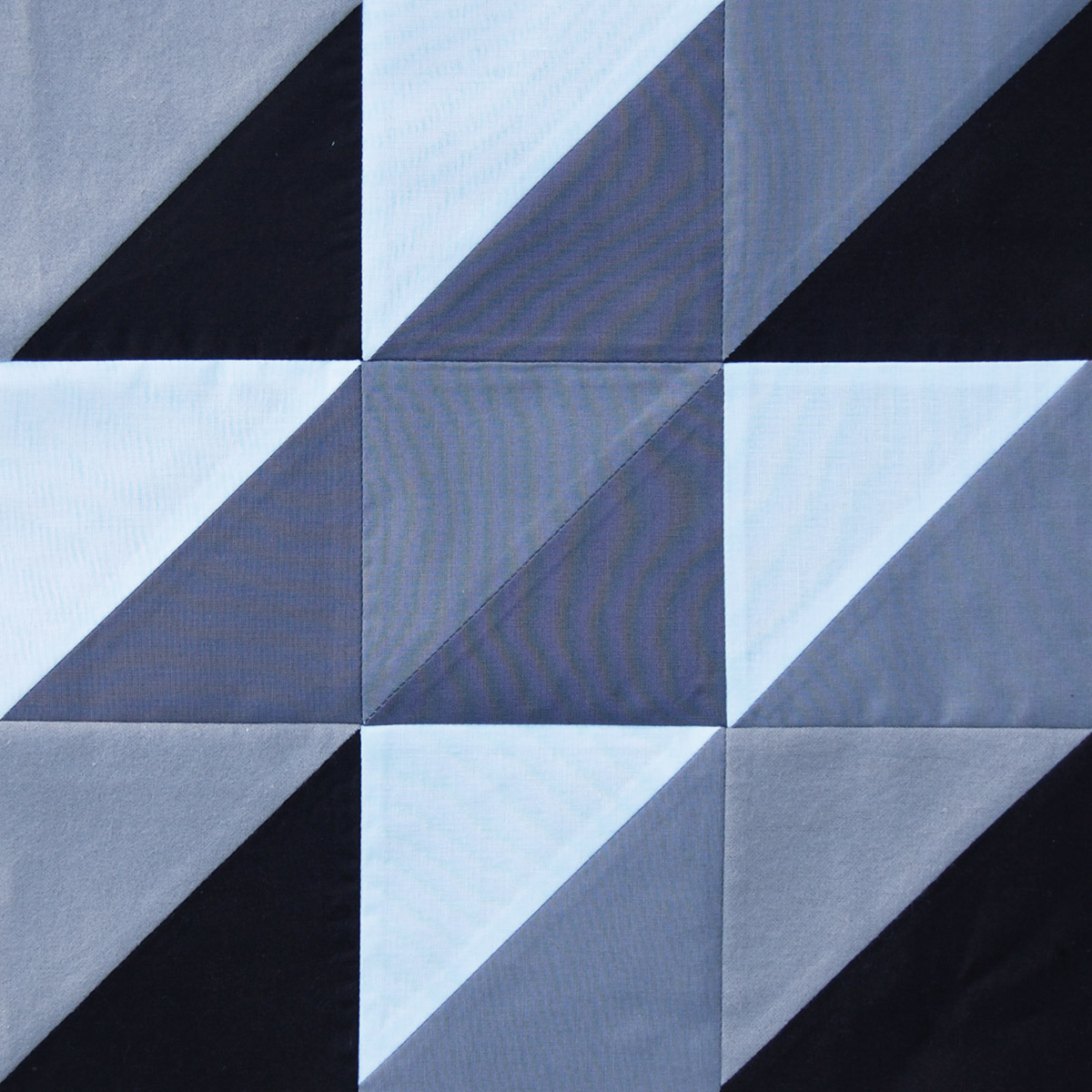
Although this may seem like a simple combination, it can be very difficult to produce a balanced design using only values of black, white and gray.
Knowing the basics of color harmony is a great way to help you fine-tune your own color style. This does not mean that the laws of harmony are the right way, or the only way to coordinate colors. Sensitivity to different colors, color preferences, and personal style are different in each and every individual. Your particular color personality is specifically your own! Have fun learning more about the different color harmonies; make a note of what you like and what you don’t like, and give some new ideas a try in your next quilt or sewing project.
How to Print the Color Harmony Cards
Download the Color Harmony Basics Printable Cards here.
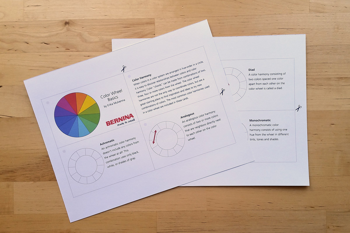
Print the cards at 100% (with no scaling or stretching to fit the page) on cardstock or heavy paper.
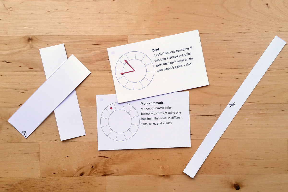
Carefully cut out the cards along the dotted lines.
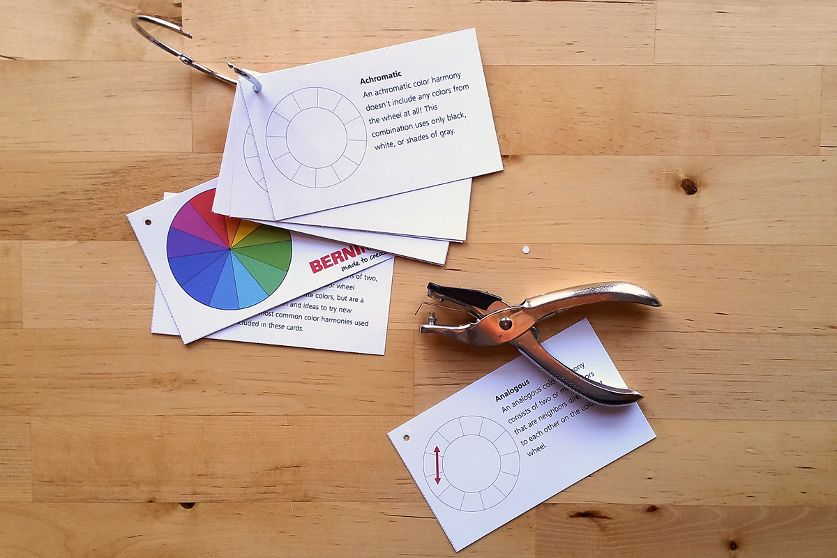
Punch a hole in the top left corner of each card, and attach all together with ribbon or a ring. Or, add these cards in with the Color Wheel Basics cards from the first post to complete the set. You can even add in fabric samples glued to 3″ x 5″ index cards to your card set for reference (see tips on making your own sample color harmony cards above).
Keep these close to your sketchbook, color journal, or wherever you like to explore ideas for new quilts or sewing projects, and enjoy!


What you might also like


6 comments on “How to Use a Color Wheel”
-
-
Thanks rosier for visiting WeAllSew, and I hope you enjoy the color cards! – Erika
-
-
Thank you so much. I love having the info in my hand. You are appreciated.
-
Thanks so much for visiting WeAllSew, and I am so happy to hear that you appreciate the post about the color wheel! I hope you enjoy the cards, and have fun playing with color. – Erika
-
-
Thanks for expanding my knowledge of the color wheel.
-
WOW
I am very very color challenged. I mean, I can put colors together and patterns, but this information is like a key to the treasure chest to inspiration and fun. Thanks!!
Leave a Reply
You must be logged in to post a comment.

Thanks. We all know the colour wheel but much easier to have cards available for easy reference.