Color Wheel Basics
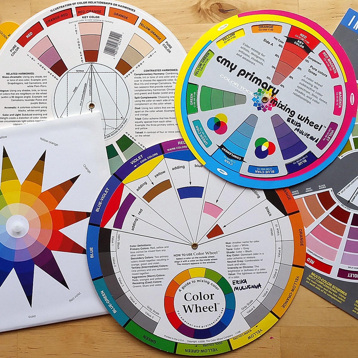
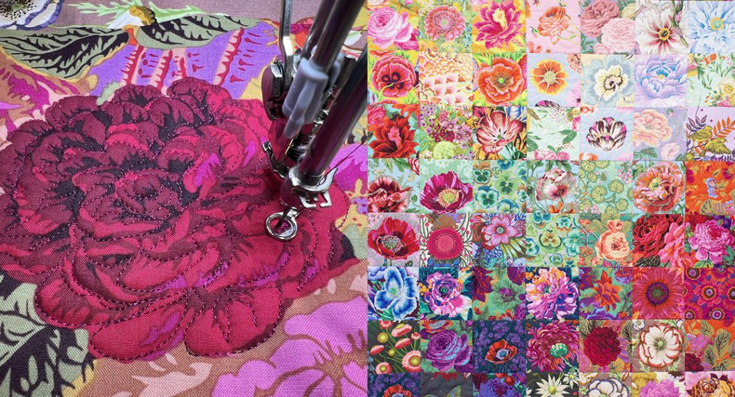
Color wheels are not just for artists anymore; they are used by all kinds of creative people working with color—florists and landscape designers, decorators and interior designers, graphic designers, filmmakers, and comic book artists. Did you know even quilters and sewists have been using a color wheel to help with fabric color choices? Even machine embroiderers can use a color wheel to help pick out thread colors for embroidery designs! If you haven’t tried using a color wheel before (or maybe never even heard of one) and would like to learn more about using this tool to help with selecting and coordinating fabrics, this is the series for you!

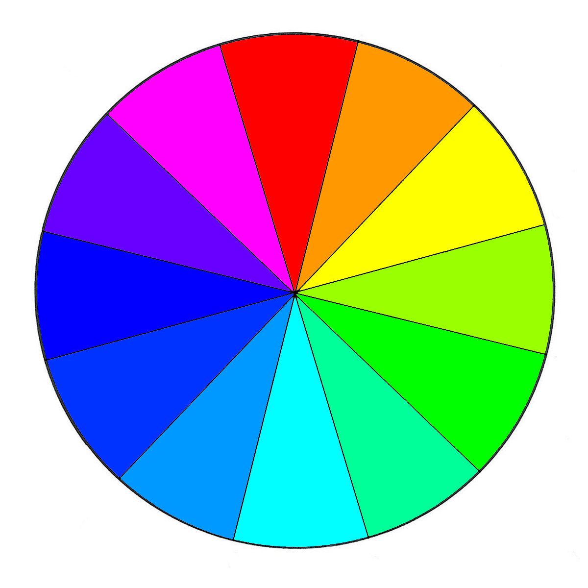
I first learned about color theory while studying fine arts in college, completing lots of basic color assignments with paints. Having the freedom to mix almost any color with paints is a lot different than working with the colors you are limited to in fabrics. I recently became interested in revisiting color theory again to see how it could be applied to color in fabrics. I’ve read lots of books about color theory both old and new, and even recreated some of those basic color theory assignments from my college days with fabrics instead of paint. The fabric color wheel above is inspired by one of those basic assignments; creating a 12-step red/yellow/blue color wheel.
It turns out that you can easily apply color theory to colored fabrics, and in this week’s post we’ll take a closer look at what a color wheel is, and learn about the three most commonly used color wheels. Next week we will look at how to use either of these color wheels to find color harmony with fabrics and get inspired to try some new color combinations.
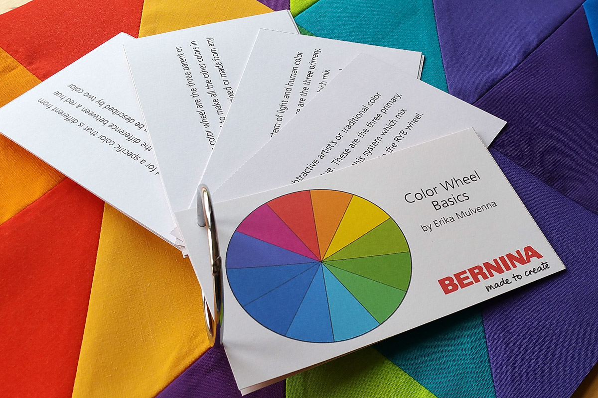
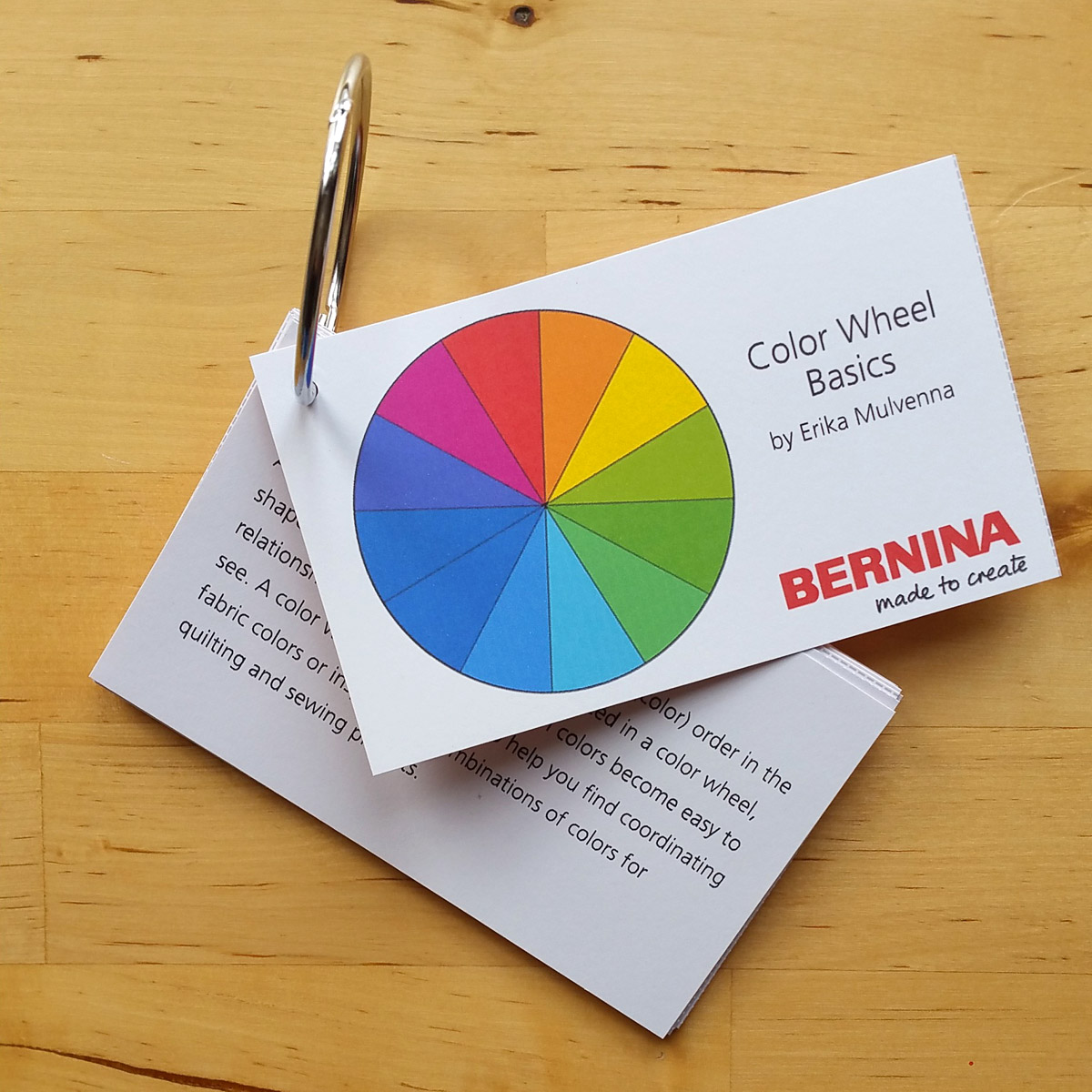
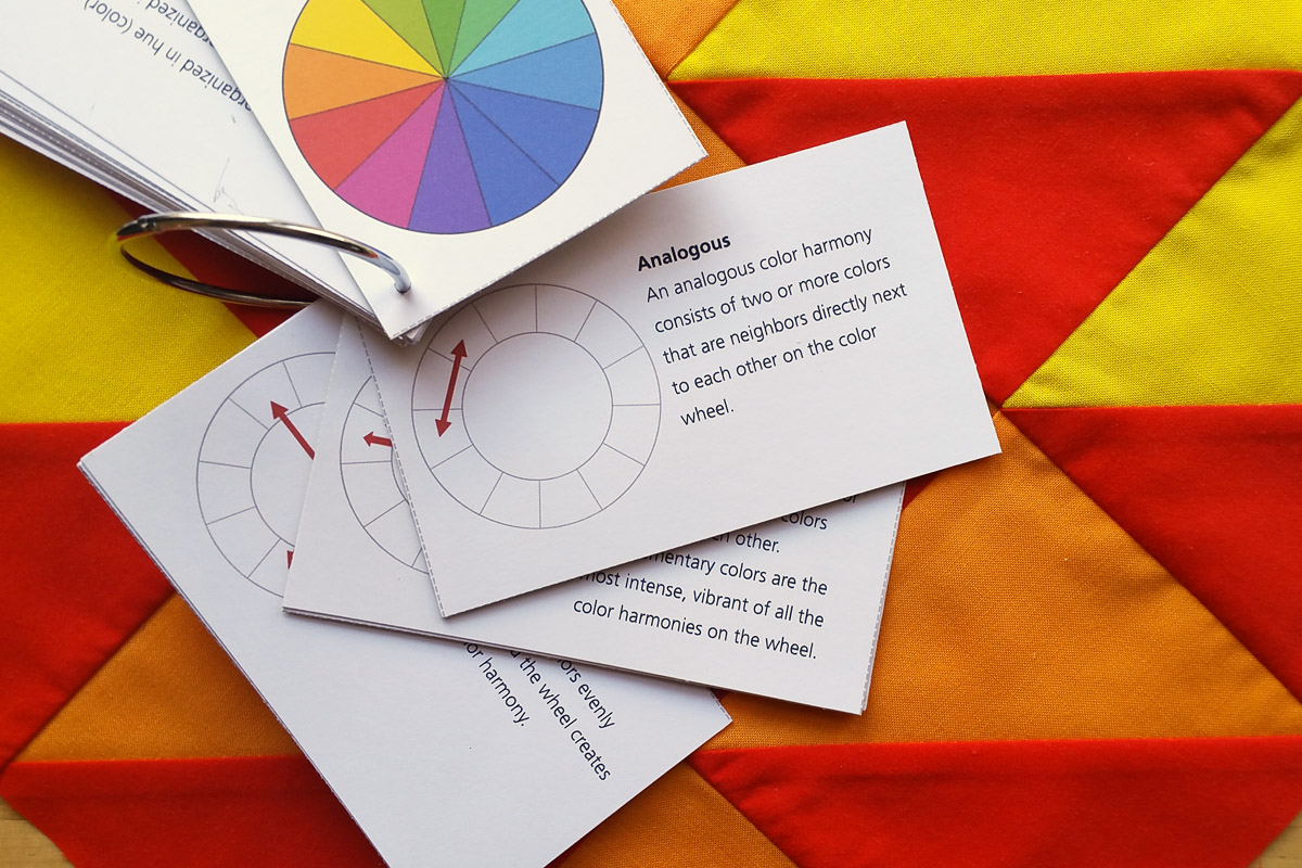
As a bonus, at the end of this post you’ll find our free PDF printable Color Wheel Basics cards to help you remember what you’ve learned! Look for the free download and instructions on how to print and assemble your set of cards at the end of the post.
The first color wheel is over 300 years old!
I bet that Isaac Newton is the last name you’d associate with modern color wheels (unless you’re a total color theory geek like me)! Newton first experimented with light and prisms in 1666. When Newton refracted bright sunlight through a prism in a darkened room, he saw a bright band of colors like a rainbow. He named this band of colors the spectrum (from the Latin word “spectrum” meaning ghostlike apparition). Newton gave a lot of thought to this visual spectrum and began to make comparisons between these colors in the spectrum and musical notes in a scale.
He figured that just as sound in a ringing bell or musical string creates waves traveling through the air sensed by our ears, so also the rays of light reflecting from an object create waves that the eyes sense as colors. In a musical scale of 7 notes, individual notes can be combined to create new chords and harmonies. Newton thinks “ah-ha!” when he makes this comparison and decides there are 7 individual colors in his visual spectrum to correspond with 7 notes of the musical scale. Just like musical notes, these visual colored notes can be combined to create new chords. Newton named these colors Red, Orange, Yellow, Green, Blue, Indigo and Violet (do you know ROY G. BIV is the acronym for Newton’s spectrum?).
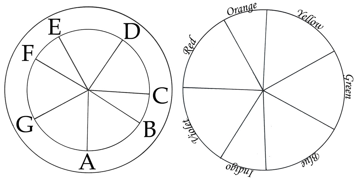
Newton did something extraordinary with his scale of colors! First, look at how mathematician and philosopher Descartes created a circular representation of the musical scale pictured on the left (Newton studied Descartes as an undergraduate at Cambridge). Newton also created a similar circle with the colors in his spectrum, pictured on the right. This simple diagram becomes the very first widely published color wheel in his book Optics published in 1704! It isn’t exactly as orderly or symmetrical as our modern day wheels, but it is an amazing beginning.
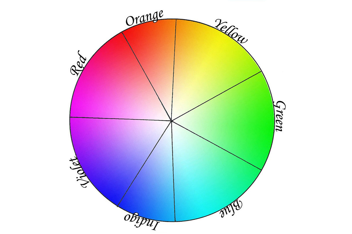
Once displayed in a wheel in hue order (hue is another word for color), interesting relationships between colors start to appear. For instance, you can easily separate the colors into those that appear warm (red, orange, yellow) from those that appear cool (green, blue, indigo, violet).
From this simple beginning color wheels have appeared in all different shapes, sizes and colors, each representing a different color system. Today there are three major color systems most often used in color wheels, all of which we’ll look at below. And while you can use any of these color wheels to spark ideas about color or find inspiration for color combinations, only one system truly represents how we perceive colors (our eyes detect light waves and our brains perceive these signals as colors).
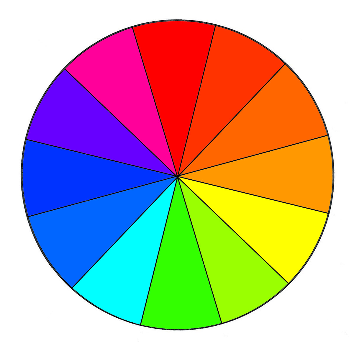
The Artist’s Subtractive Color Wheel

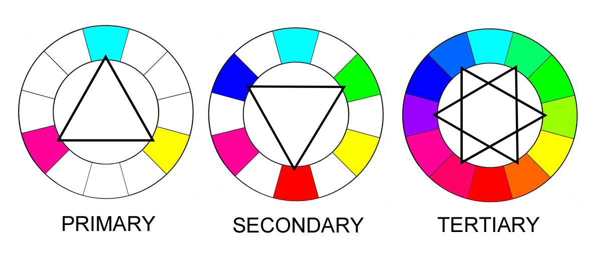
You’ll notice that all of these systems are identified by the abbreviation for the three basic, stand alone colors in each system called primary colors. This is the RYB (Red/Yellow/Blue) color wheel, also known as the subtractive system, Artist’s Color Wheel or Traditional Color Wheel. This system represents how colored pigments like paints, inks or dyes mix together to form other colors, and is a starting point for artists to learn how to mix colors together. It’s also the system taught to young children about mixing paints (have you ever read The Color Kittens?).
The three basic colors in this system are Red, Yellow and Blue; they cannot be mixed from any other colors in this system. Look at the illustration above to see how these colors mix together to create the wheel. These first parent colors are called the primary colors.
Mixing each of the primary colors together results in three new colors; red and yellow make orange, yellow and blue make green, and blue and red make violet. These are called the secondary colors.
Mixing each of the secondary colors together once more with a primary results in a set of new colors; red-orange, yellow-orange, yellow-green, blue-green, blue-violet and red-violet. These are called the tertiary colors.
The Printer’s Partitive Color Wheel
Next let’s take a look at the CMY (Cyan/Magenta/Yellow) color wheel, also known as the partitive color system, printer’s color wheel, or process color wheel. This is the color system of transparent inks used in the 4-color printing process (with black being color #4). Think of old comic books or newspaper color pictures made of those little tiny overlapping dots. You can also see this system used in most food packaging containers like cereal boxes. Artists may also use this wheel as a starting point to learn how transparent pigments mix together.
The three basic or primary colors are Cyan, Magenta and Yellow.
Mixing each of the primary colors together results in secondary colors red, indigo and green.
Mixing each of the secondary colors together once more with a primary results in tertiary colors purple, blue, blue-green, yellow-green, orange, and red-magenta.
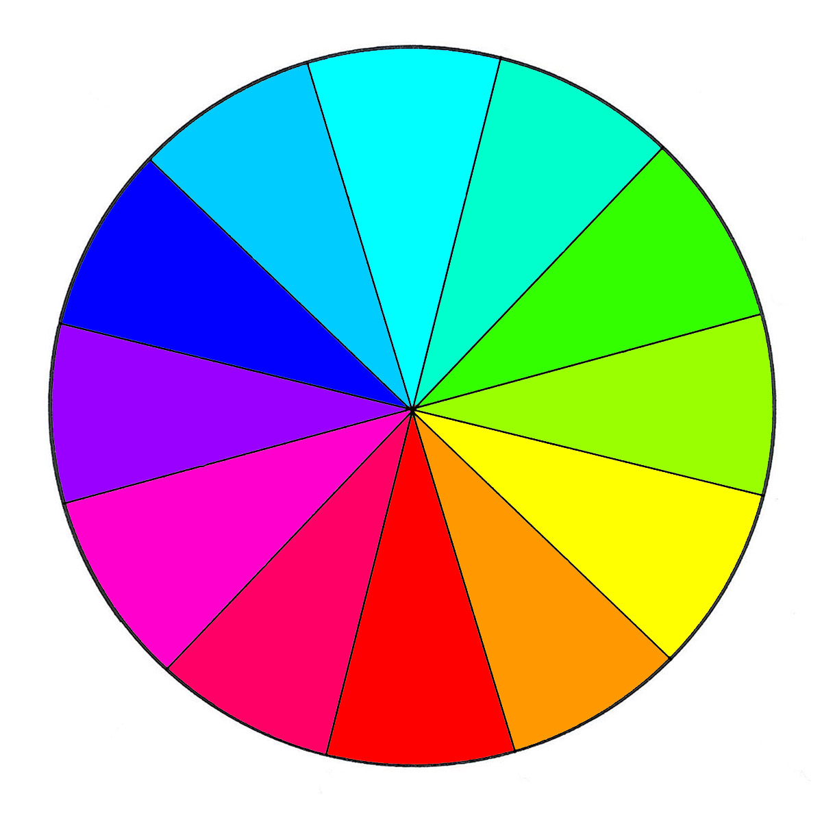
The System of Light and Human Color Perception
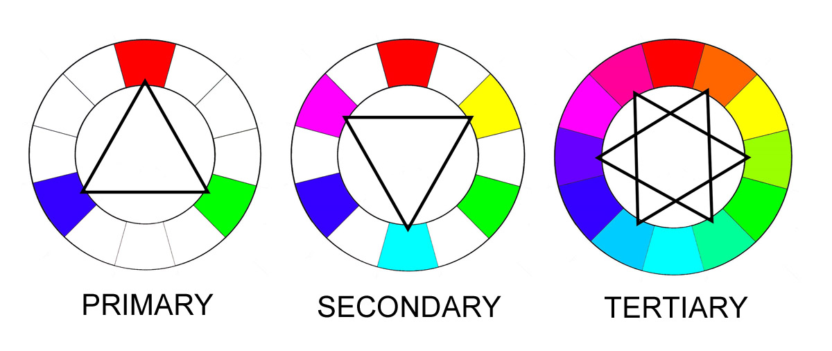 And last but not least, here is the RGB (Red/Green/Blue) color wheel, AKA the Additive color system, the computer monitor and television display system, the system of Light; and most importantly the basis of how humans perceive colors.
The three basic or primary colors are Red, Green and Blue.
Mixing each of the primary colors together result in secondary colors cyan, magenta and yellow.
Mixing each of the secondary colors together once more with a primary results in tertiary colors orange, yellow-green, blue-green, blue, blue-violet, and magenta.
Using a color wheel to study color relationships is a fantastic way to start learning more about colors and exploring your own color preferences, likes, and dislikes. Stay tuned for the next post to learn about all the different laws of color harmony and how to make them using fabrics! Until then, start giving some thought to the colors all around you. Download your Color Wheel Basic cards and look them over, these are some of the basic terms and definitions to know when using a color wheel. You can also start a color notebook, sketchbook or journal and begin recording your thoughts about colors. Write down colors or color combinations you really like, or feel drawn to. This can be a great way to find ideas for color combinations in your next quilt or sewing project.
How to Print the Color Wheel Basics Cards
Download the Color Wheel Basics Flash Cards.

Print the cards at 100% (with no scaling or stretching to fit the page) on cardstock or heavy paper. Carefully cut out the cards along the dotted lines.
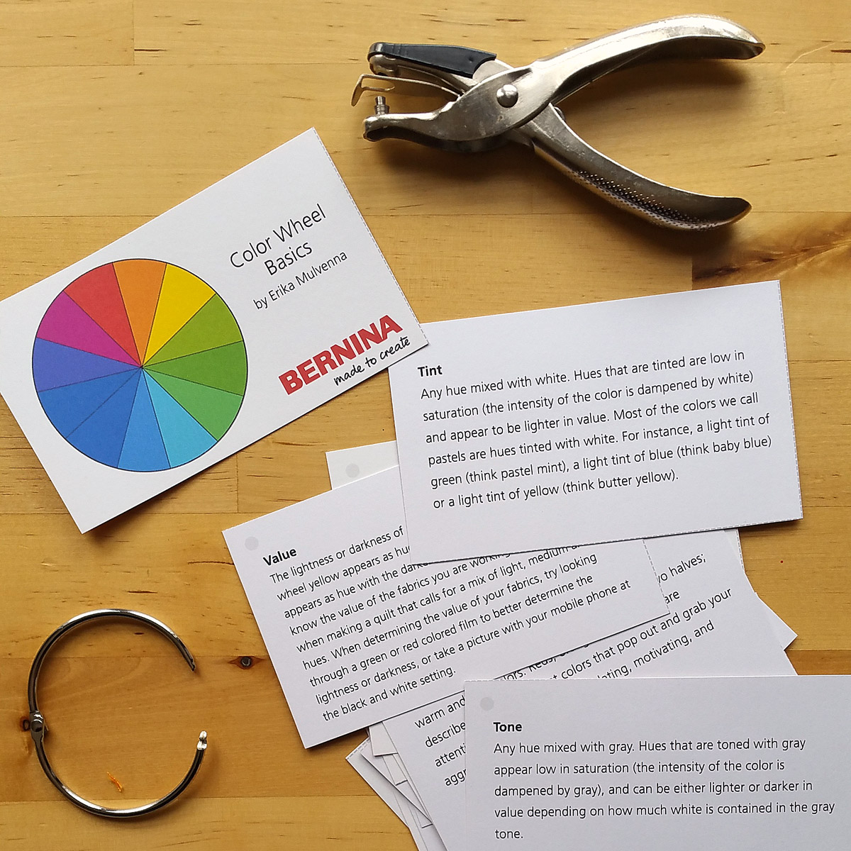
Punch a hole in the top left corner of each card, and attach all together with ribbon or a ring.
Keep these close to your sketchbook, color journal, or wherever you like to explore ideas for new quilts or sewing projects. Until next week, keep looking at the colors all around you and enjoy!

What you might also like


12 comments on “Color Wheel Basics”
-
-
Thank you so much paulettehodge, I hope you enjoy the series! – Erika
-
-
thank you for the post on color, i’m trying to download the cards, but all i get is a blank page. is anyone else having this problem or is it just me? and is there something you suggest i do about it?
thanks again,
shoshana [email protected]-
Hi shoshu, it looks like the download of the PDF file is working on my end. I can suggest a few things to try. First, make sure that you have an up-to-date PDF reader installed on your computer. Next, instead of trying to open the file to view it, save it to your computer first by right-clicking directly on the file, and choosing to “save as” or “save link as” to a destination on your hard drive. Then, try opening the file to see if it works. Best of luck! – Erika
-
-
Thank you, Erika, for an excellent discussion on the color wheel. I printed out the notecard Basics; really great info, simplified and contained in a few cards! Now I know why my color printer replacement cartridges aren’t red/blue/yellow…..It’s the Printer’s Partitive Color Wheel instead! It’s always a good day when you learn something new! Linda from Maine
-
Thank you Linda for visiting WeAllSew and for your nice comments! I’m so glad you were able to pick up a bit of new appreciation for color theory. Enjoy the colors all around you every day! – Erika
-
-
Thank you Erica for a fascinating look at color and some of its history. I’ve studied color a little bit for quilting, but this information was all new! Can’t wait to read more!
-
Thanks sandra8491 for visiting WeAllSew, and I am so happy to hear that you are enjoy the posts about color theory! 🙂 – Erika
-
-
Thank you for these fun color cards. Is it OK to make them for my Guild’s sewing retreat? I know they all see this but not sure of how many people actually put the cards together. I love this idea! Thank you! Patty
-
Hi wonderwalls, thanks for visiting my post at WeAllSew! If you’re only printing the cards to share with your guild mates, and not to sell, there’s no problems. Enjoy the color fun! – Erika
-
-
Thank you for reposting this! I have been a color analyst for people and loved sharing the three dimensions of color (hue, value, chroma). It helps to see it in dressing as well. Your explanation is wonderful. I look forward to reading the rest of the article.
Leave a Reply
You must be logged in to post a comment.

Excellent first content!