Color Schemes for Sewing
Do you want to use more color in your sewing projects, but are unsure of what colors to pair together?

Today I am going to teach you a little bit about color theory, and how you can use it in your sewing projects. The hot phrase this year is “dopamine dressing,” which is about how what you wear can affect your brain and your mood. Getting out of your comfort zone with color schemes can also trigger this reaction.
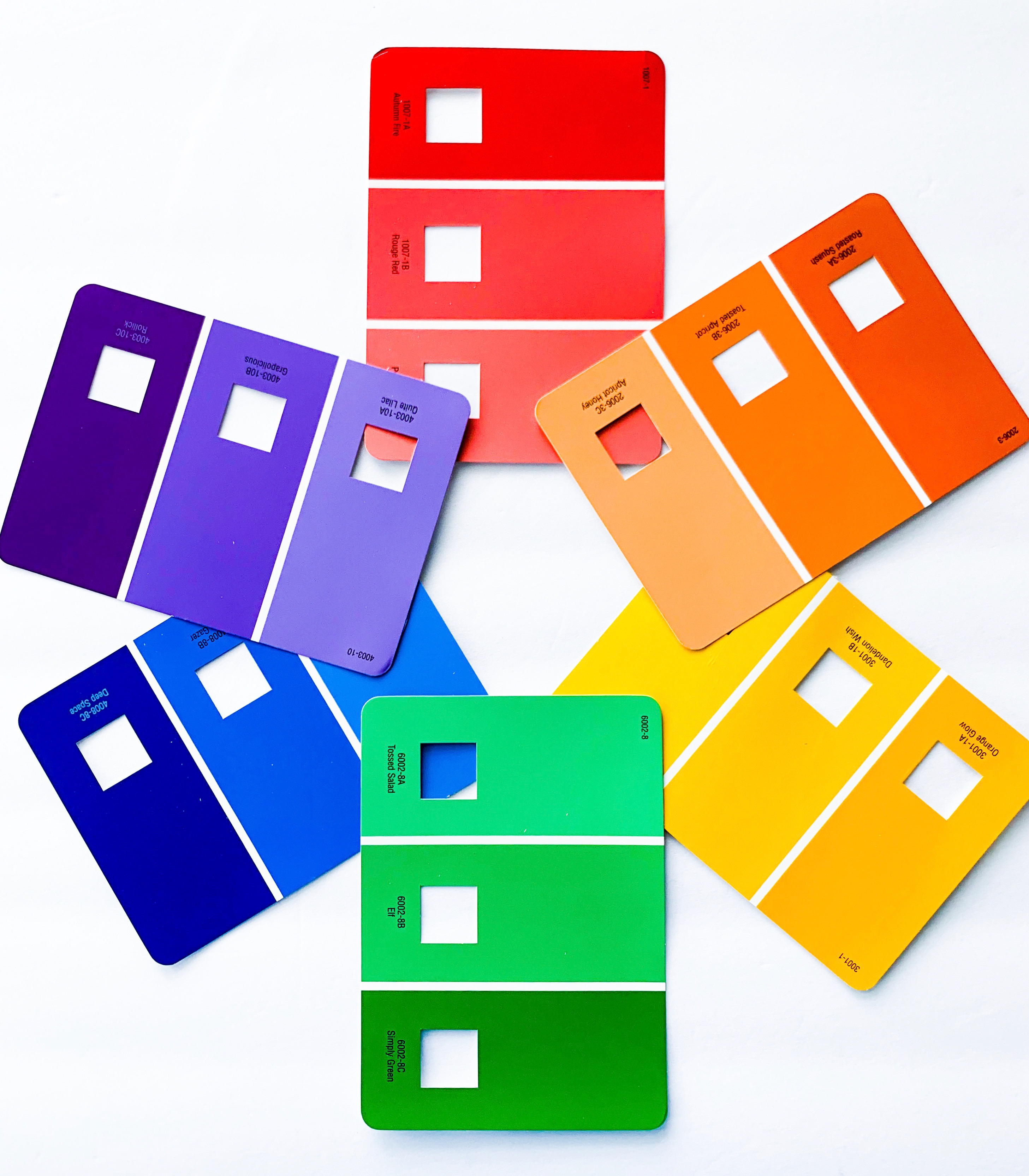
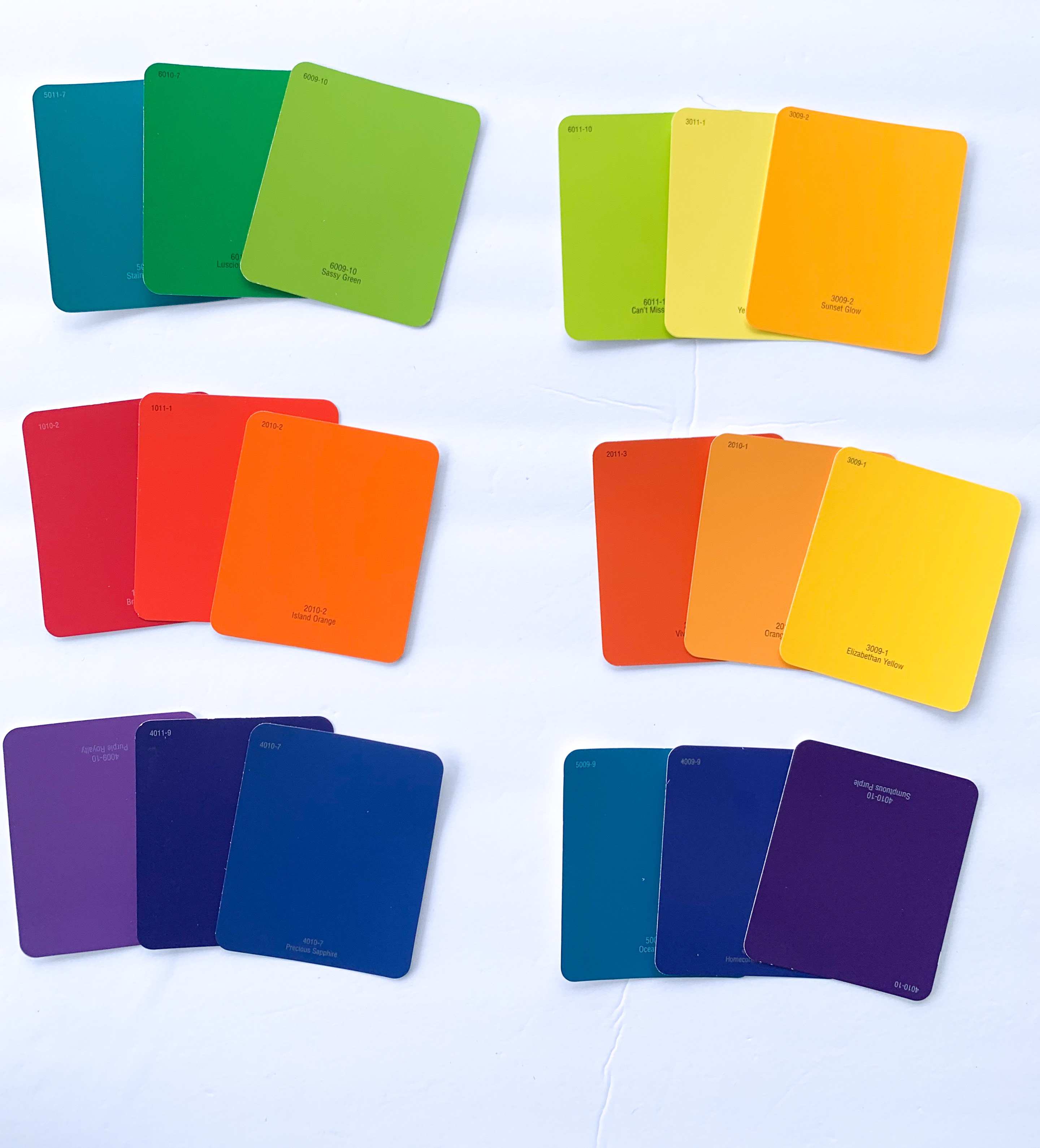
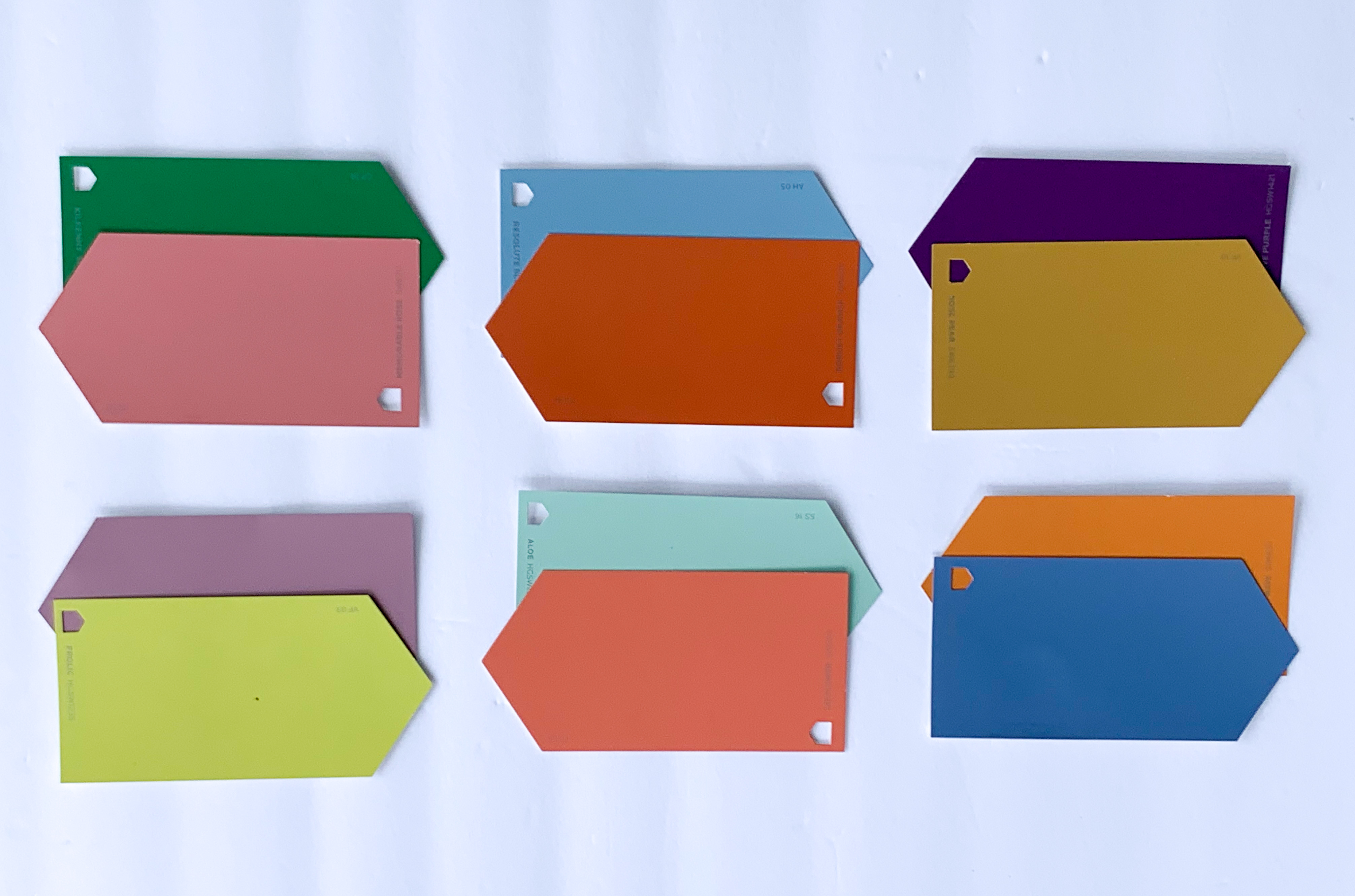
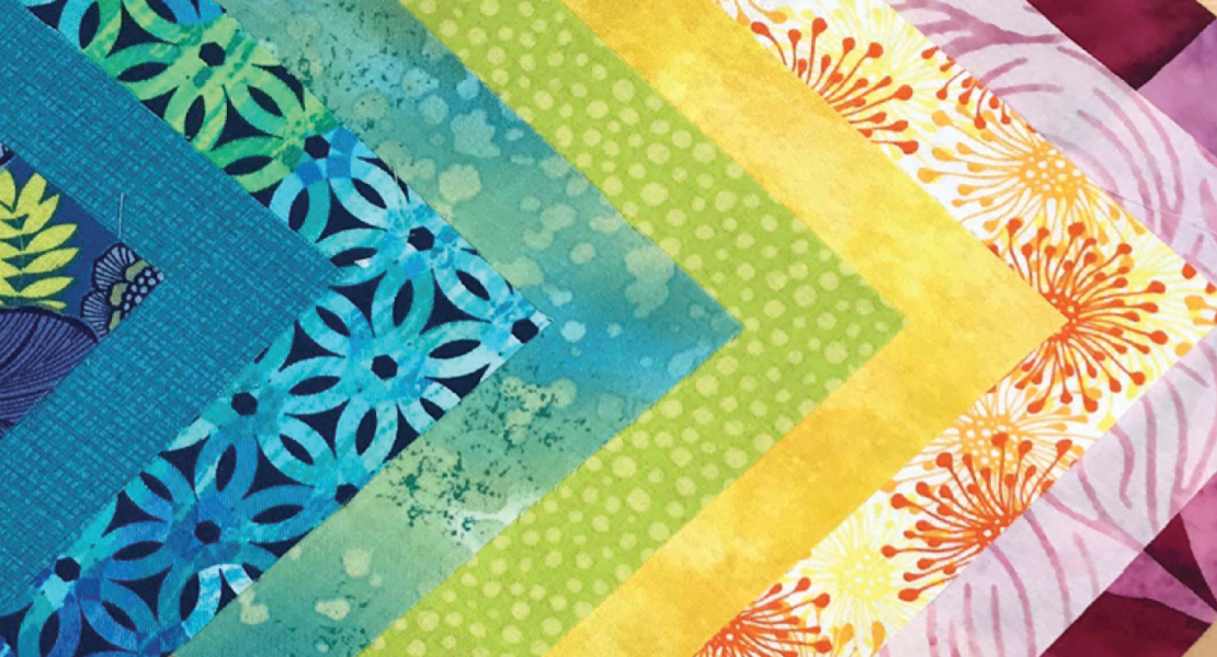
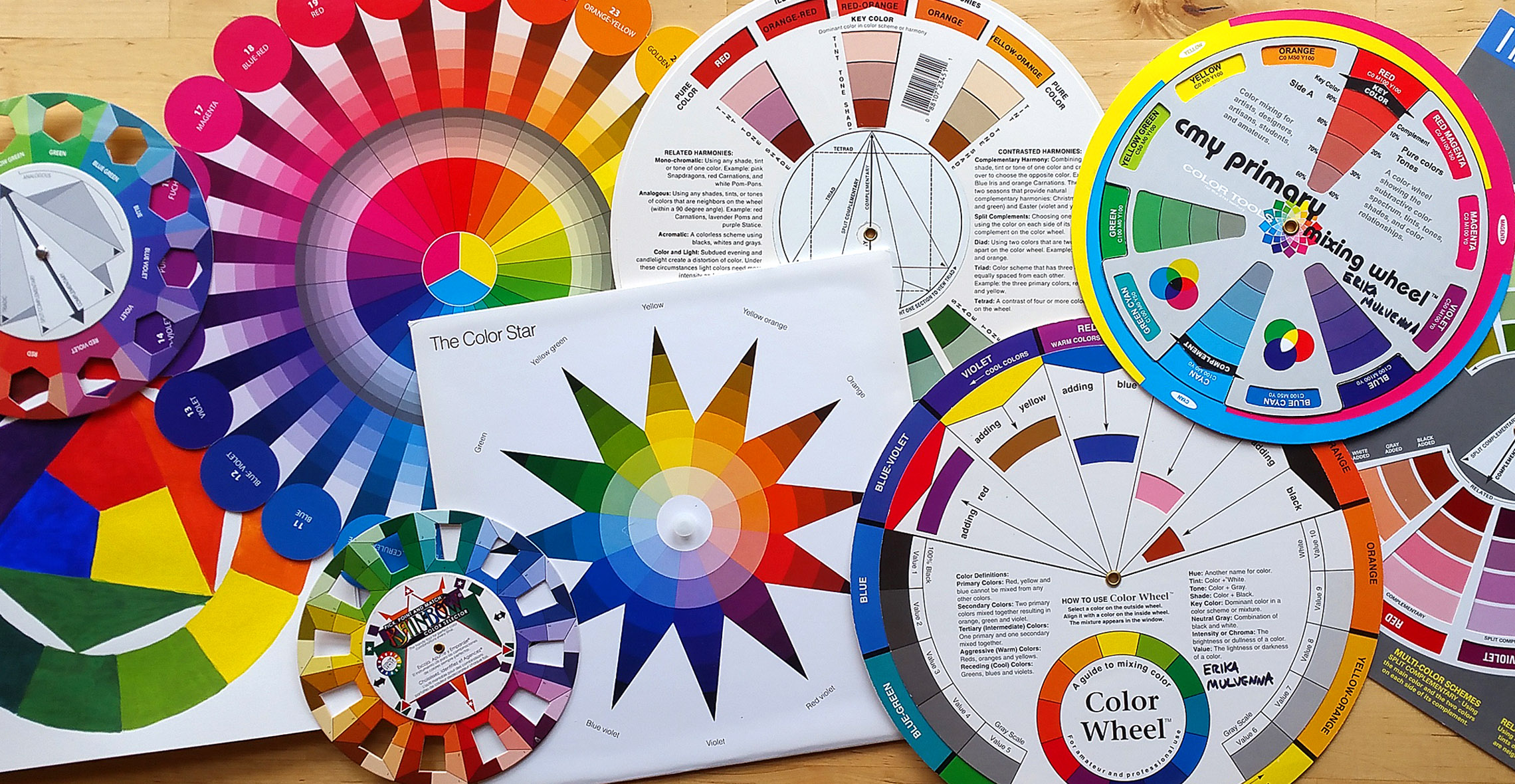
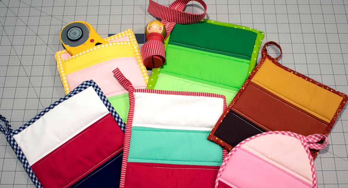
Here is a fabric color wheel. Let’s talk about monochromatic, analogous, and complementary colors. These color schemes can help guide you in your color coordinating!
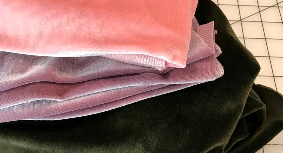
Monochromatic

Monochromatic means one color. When you do different tints and shades of a color (or different values), you are creating a monochromatic color scheme. It is fun to stick to just one color sometimes, and really explore it. Above you can see different shades of indigo in this Shibori dress I made out of different textiles I’d dyed.
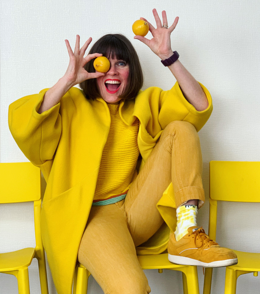
Look at all these shades of happy yellow! Monochromatic! Monochromatic is an easy color scheme to do and is a good starting place for those that are scared of color. Let’s move on to another easy color combo . . .
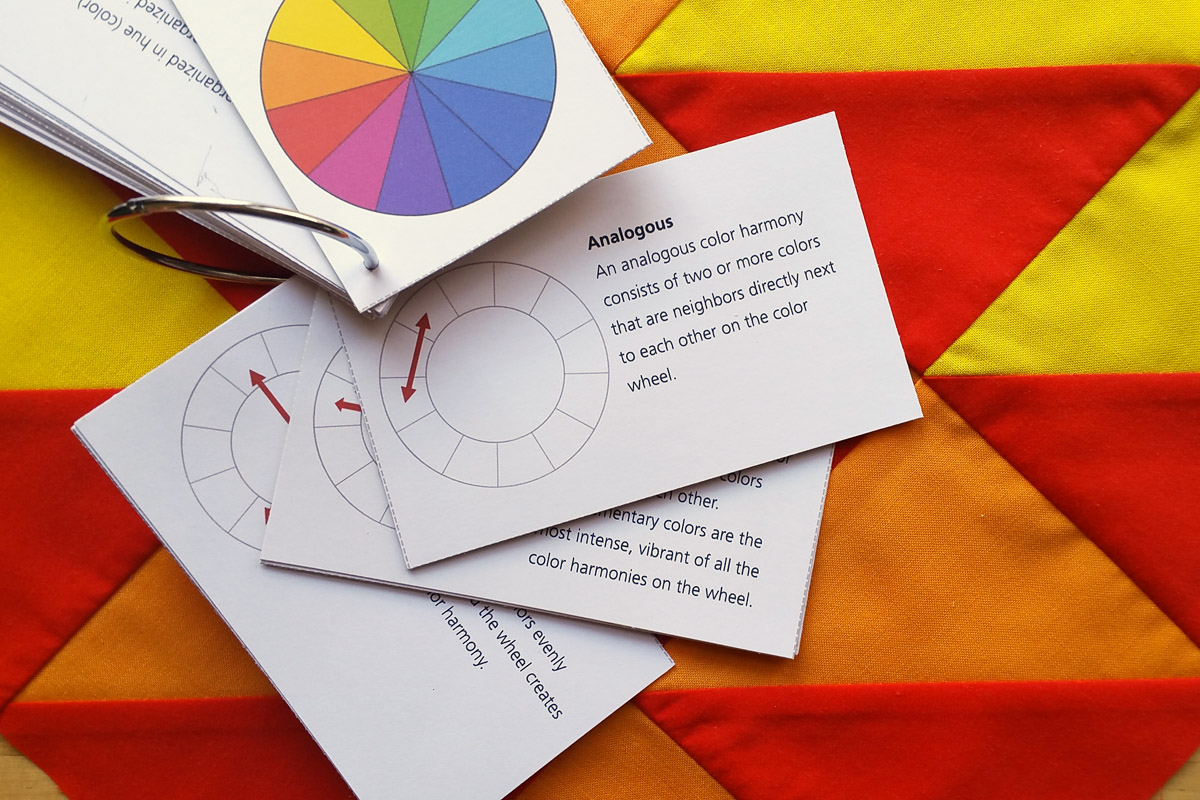
Analogous Colors

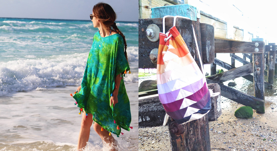
Analogous colors are next to each other on the color wheel. They contain a primary color in common when making them. ABOVE: Pink (red mixed with white) and purple both have red in them. They feel nice together since they are similar colors.
Analogous color schemes will always be easy on the eyes. Think of the sky and trees: blue and green both have blue in them.
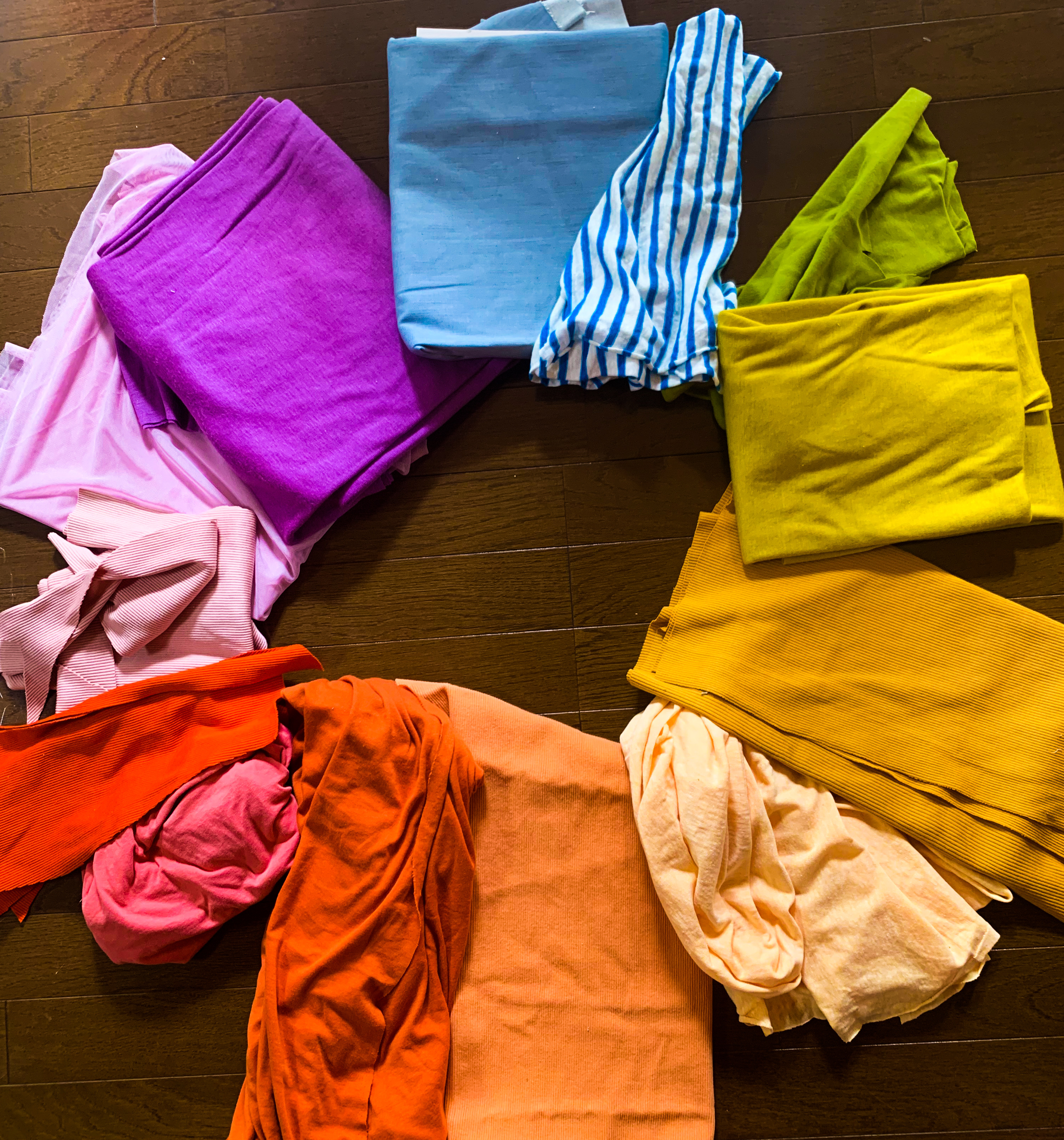
Here pink is paired with a burnt orange/brown color. Even browns and greys have other colors in them which often makes them read warm or cool.
Here I have yellow-greens next to greens and blue greens. It’s like a forest!
The next color scheme we will look at is . . .
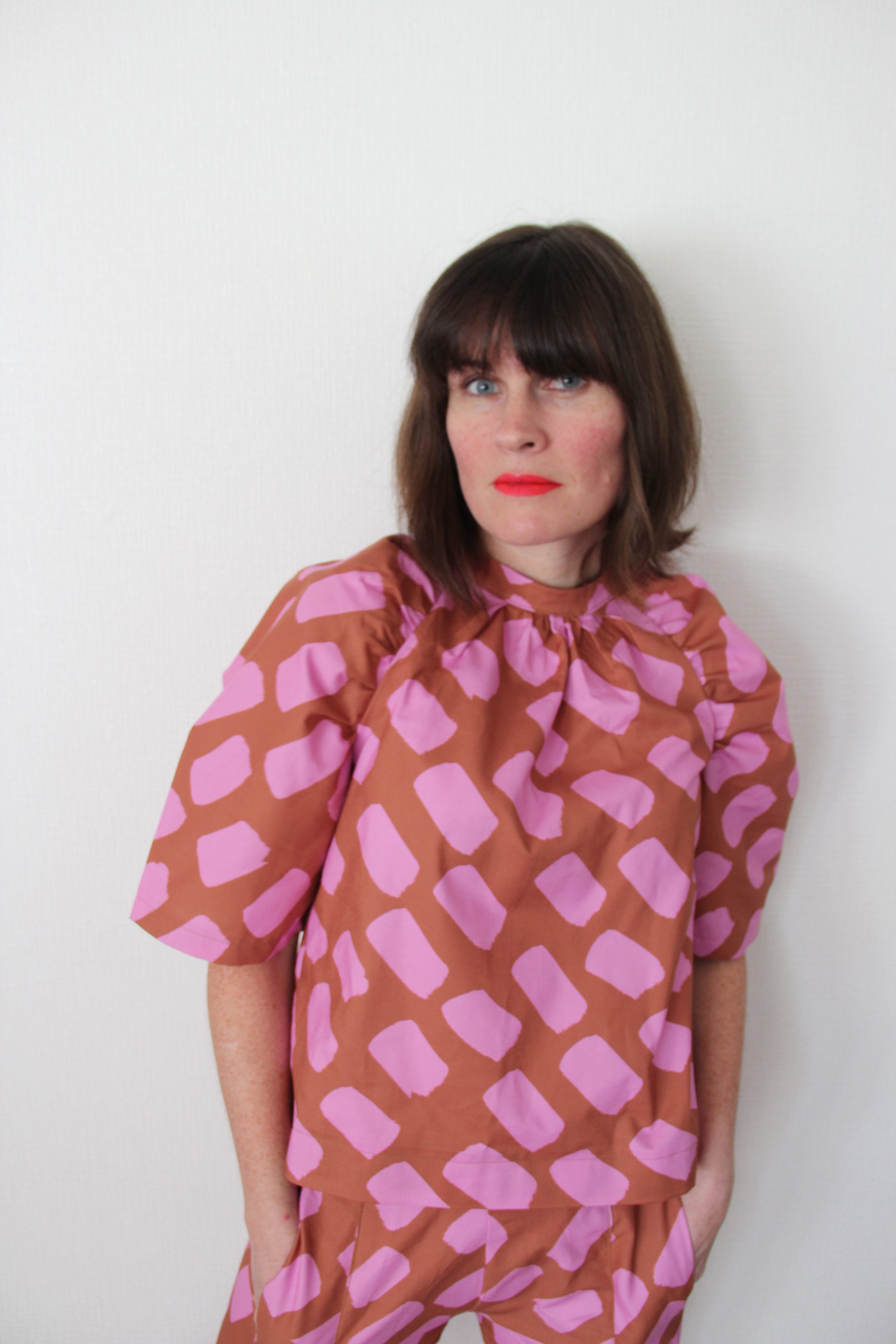
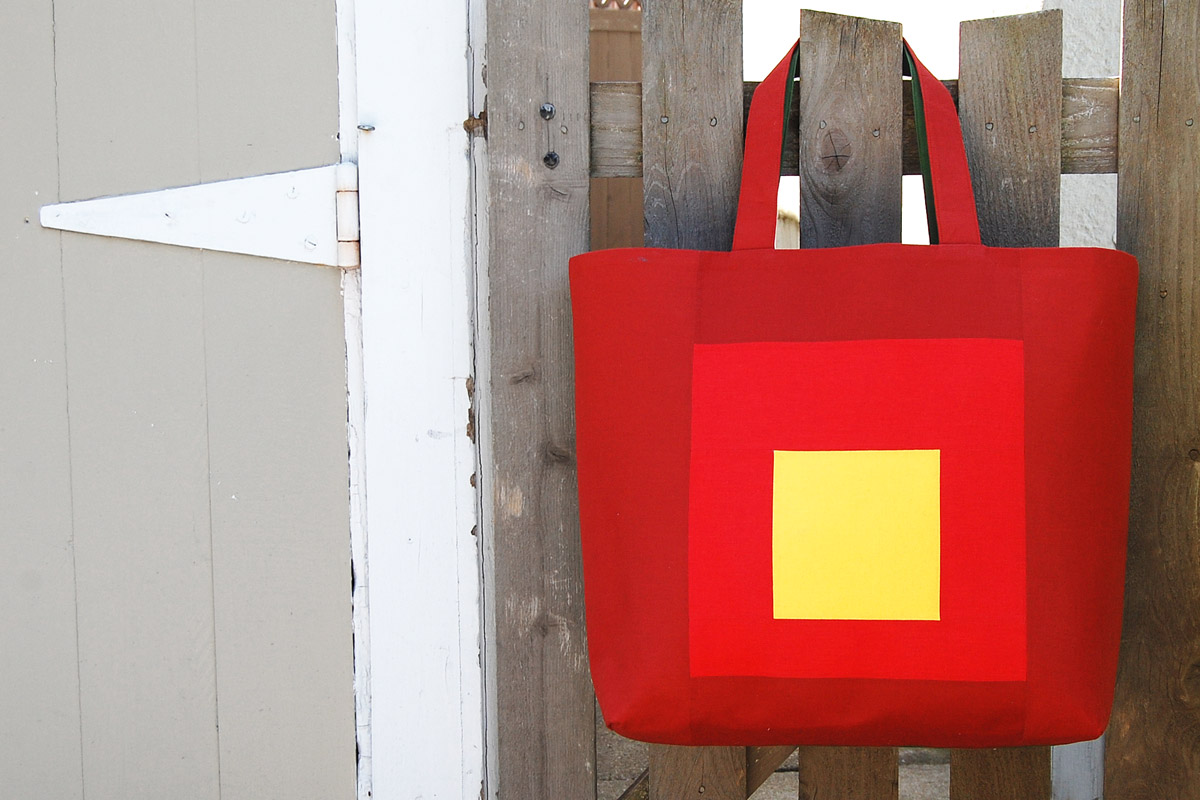
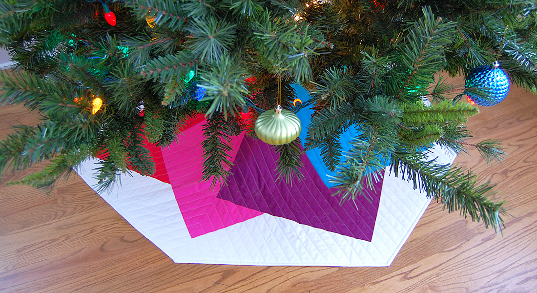
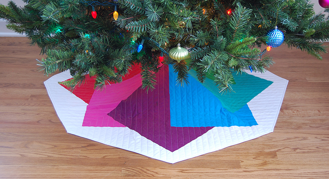
Complementary Colors

Complementary Colors are opposite of each other on the color wheel. They are the most different from each other. Mixed together they make brown! Mud! When painting, you can tone down one by mixing a little of the other. They are also so clashing that together they really catch your eye. Because of that, they are often used for sports teams and building signs or logos. Maybe you think you don’t want to try this color scheme out because it makes you think of those sports teams etc. But hear me out. You CAN make them look great together!

In this outfit above, I have blues and oranges together, but they are less jarring because I have used lighter blue, muted oranges, etc. This is how you can make opposite colors look good together if you don’t like the two saturated colors side-by-side. Try a lighter, darker, or more muted version of the colors together.
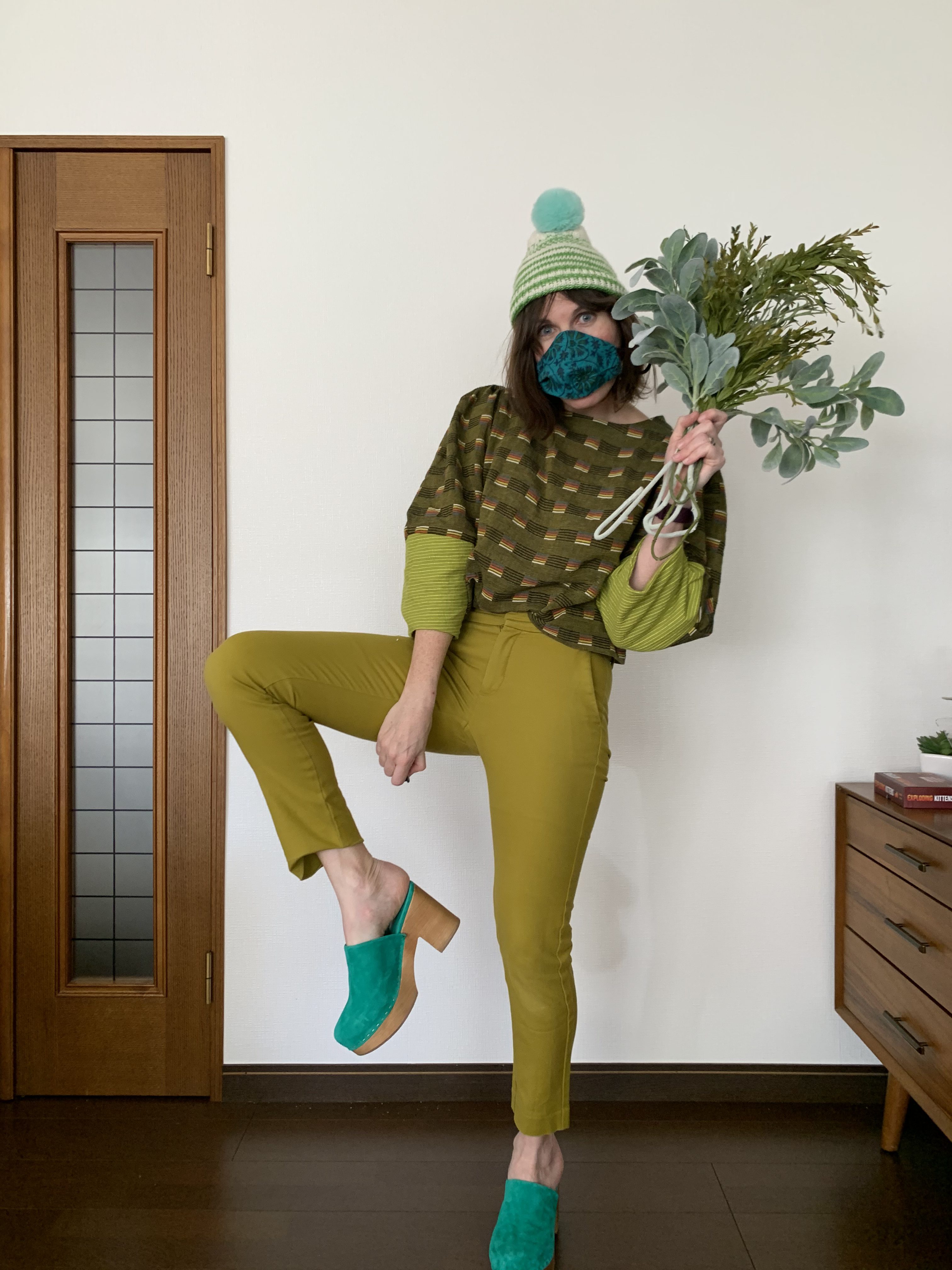
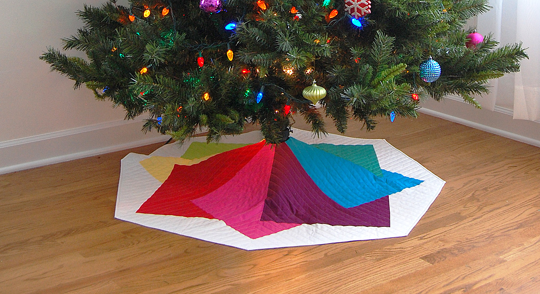
“Faux” Split-complementary

“Real” Split-complementary is a color plus the two colors on the opposites of its complement (does that make your head spin?), I am here today to propose an easier version of that idea. One that combines both Analogous colors and Complementary! It’s easy! Put two analogous colors together then pick the opposite of one of those colors and add that one in. It has the nice visual quality of analogous, with the punch of complementary—making it my most favorite color combo.

Yellow-greens and green paired with hot pink (opposite)! Isn’t that pop of hot pink the fun touch to this soothing green outfit? That is the beauty of this color combo!
In my book Wear Happy Color: A Guide to a Colorful Wardrobe, as well as my online class, I go more in-depth about these and other color schemes. The best thing to remember about color is that whatever colors make you feel happy, those are the colors that look good together! Using the color wheel can help you try new color schemes, but there are no “wrong” answers to what colors go well together. Try something new! Look around the world to see what colors occur together in nature and try those out in a project!

For more posts about the color wheel check out these posts from WeAllSew!


Thank you for the excellent visual explanations.
I have had ( being positive now – this statement is past tense) a hard time understanding the color wheel. I do understand this much better with your pictures & they are so much fun.
Now I can picture Analogous Monochromatic & complementary colors! Thanks again