Color Basics with Amanda Murphy
Hi, all of you BERNINA enthusiasts! I hope you enjoyed the holidays! One of my favorite things about that time of year is always the vibrant colors used to decorate our homes, from mantles and beds to our tables.
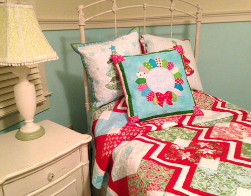
Our daughter’s room with some Modern Holiday projects – she gets the most quilts because she has aqua walls!
As quilters, we get to enjoy experimenting with color throughout the year, and not just to decorate! For many of us color experimentation is a joyful and freeing part of the creative process. Sometimes we might feel more hesitant or even overwhelmed by color choices, yet we play with color principles all the time, often without even realizing it.
Isn’t it funny how a certain color can evoke an emotional response? I know it is unpopular to say so right now but I dislike orange. I try to like it – I really do – but I just can’t fully embrace it, yet it creeps its way into many of my fabric collections.
Why is that? Well, I think in my case orange provides a bit of a “pop” against the greens and blues and aquas that I love to use. If I only used the greens and blues the resulting quilt might be restful and quite beautiful, but incorporating orange or red turns the colors up a notch. A strong contrasting color can create movement in a quilt.
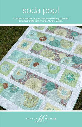
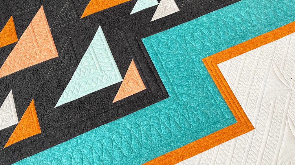
My “Soda Pop” pattern, sewn in an analogous palette.
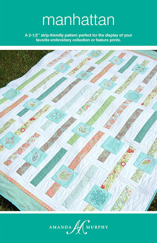
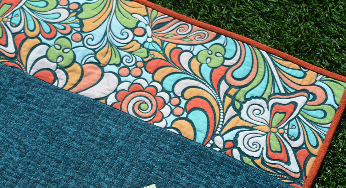
“Manhattan” in that same palette with some of the opposite colors on the color wheel thrown in.
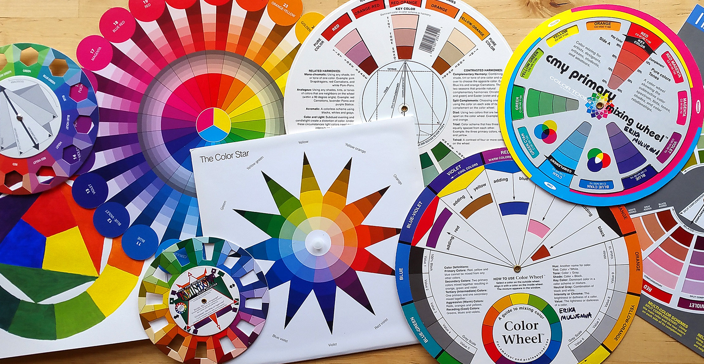
Color was one of my favorite classes in design school and I call upon the principals I learned in that class every day. Josef Albers, an early-mid 20th century color theorist who was particularly influential in design education, painted huge swatches of flat color to experiment with hue and value and our perception of space. There are reflections of these principles all over the quilting world – particularly in the modern movement – right now. So what are some of those principles?
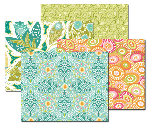
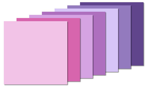
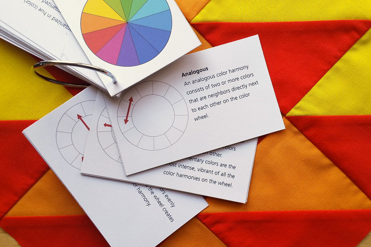
Analogous Palettes
Well, first of all let’s talk about those “restful” quilts – the ones that have analogous palettes. If you are just venturing out into the color arena, this can be an easy place to start because the harmony of the hues is sure to please. See how these color combinations create a peaceful, quiet feeling?


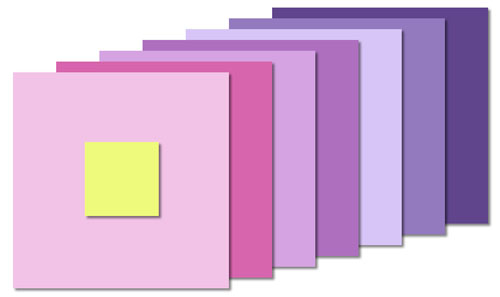
Poison Colors
You can immediately “turn the volume” up on a harmonious palette by incorporating a color opposite on the color wheel from it! I call it a “poison color.” Use that color sparingly, because it will have BIG impact. It will draw your eye from place to place in a quilt, and you can use this to your advantage!


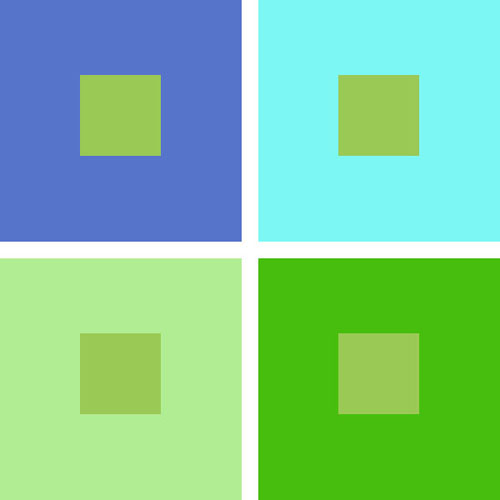
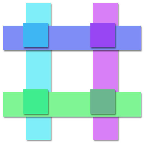
Optical Illusions: Making One Color Look Like More
Colors also can be impacted by the color in the area that surrounds them. You can take one color and put it on different backgrounds to create an optical illusion. Sometimes you can make that one color look different simply by changing the background on which it is placed.
The small pink squares in the center of each block are the same color; different background colors make them appear to be four different colors.

The same optical illusion occurs with the green squares in the centers of these blocks.
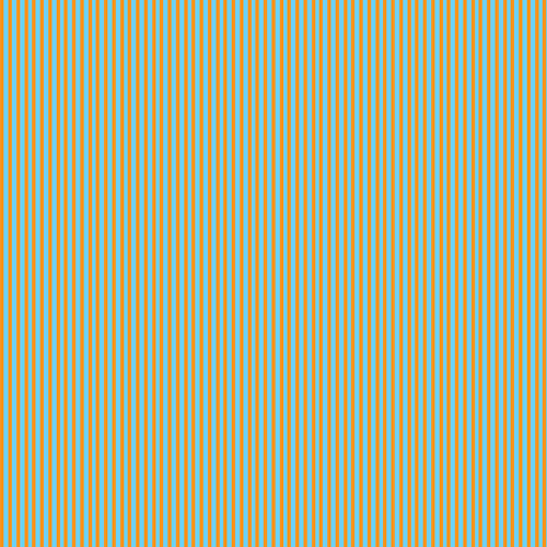
Making Colors Vibrate
Have you ever seen a quilt that seems to vibrate? That can happen when you pair two colors of the same value (light to dark) on opposite sides of the color wheel. If one of the two is darker they can look striped, and if they are analogous they can blend, but pick two colors that are opposite of the same hue and they will fight each other!
Transparency
You see this a lot in art or pictorial quilts. If you pick just the right color between two different hues, you can make them look like they are crossing each other. In art school we experimented with these principles on paper, but as quilters we have something better… fabric!
 I hope everyone takes some time in the new year to work with a palette you love and a palette you might not worked with before. And there is always working with the color you don’t love so much at all… (ahem, orange…) That is where we learn the most.
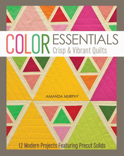
If you are interested in learning more about working with color through fabric I’ve just authored a new book on the subject called Color Essentials: Crisp and Vibrant Quilts through C&T Publishing. I made every project in the book on a BERNINA 580 using Robert Kaufman Kona precuts and Aurifil thread. (The sewing machine is a great way to experiment with color and remember – fabric and thread are more fun than paper!) We’ll be experimenting together in January – check out my blog for more information.
Next time you are at your local shop pick out a colored fabric you love – that is also, perhaps, a little out of your comfort zone – and see where it takes you!
Happy sewing!
Amanda

What you might also like


2 comments on “Color Basics with Amanda Murphy”
Leave a Reply
You must be logged in to post a comment.

I was able to view the video on my Ipad Air.