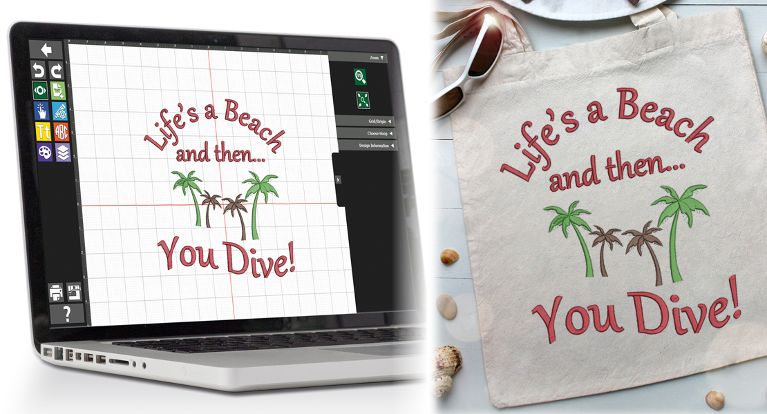
Creating Realism with Thread
When I began thread painting about 17 years ago, I assumed that all my landscapes took place at high-noon so shadows and/or shading would not be much of an issue. However, as I progressed through my thread painting journey, I realized that my thread figures needed to look more realistic which meant incorporating shading and highlighting into my designs.
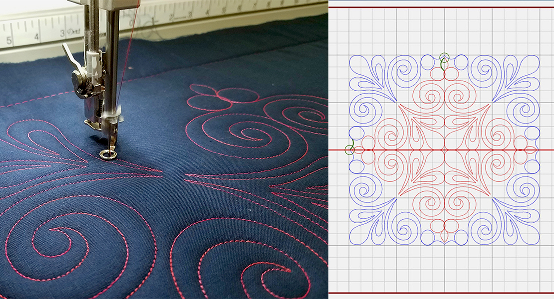
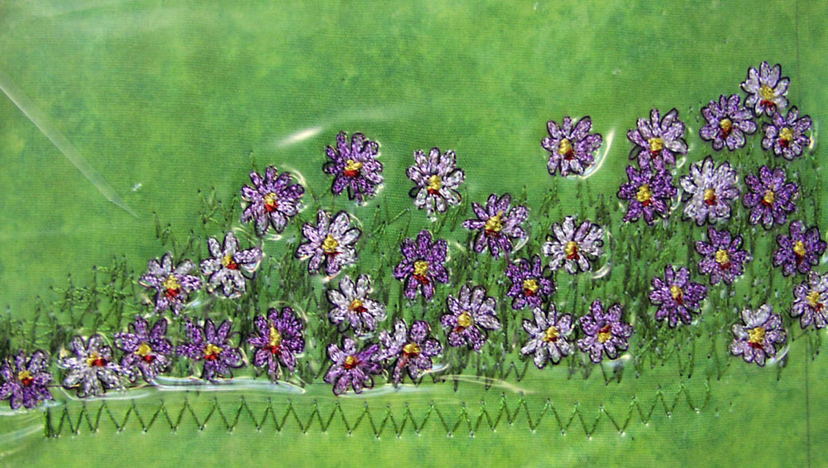
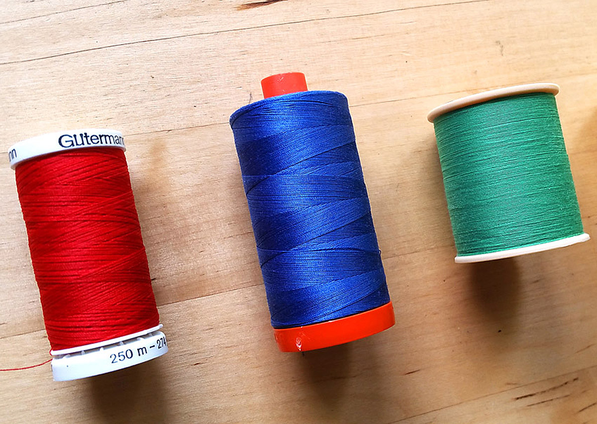
Realistic shading requires gradual blending of dark, medium and light threads. The dark thread would be the shading, the mid tones or the core color of the design would be the blending threads and a light thread would be the highlights. Each—shading, blending and highlighting—play an important role in the design looking realistic.
A shading color gives form and shows depth and distance in a design; the blending colors are the backbone of the design and are the most prominent color in the design; the highlight tells you that something is raised or closer to you and indicates the direction of the light source. Each contribute their own element of strength in a design.
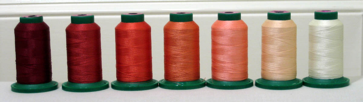
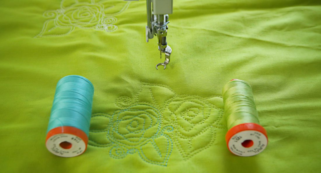
So what is the process involved in selecting the correct thread colors within a color family? Let’s assume that you would like to thread paint a beautiful coral flower using these threads.
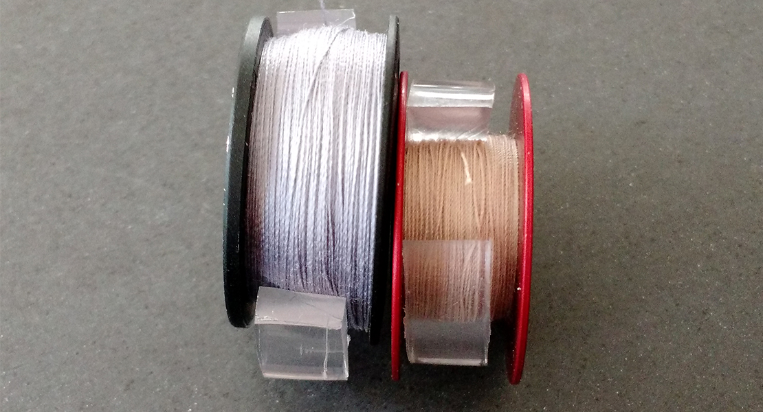
The thread colors are so beautiful why not just use them all, but that would not be necessary. The problem is that threads 2 and 3 (from the left) will stitch out basically the same color as will Threads 3 and 4. Blending colors need to be at least two shades apart, and depending on the color family sometimes three or even four. The colors need to have enough value steps between them so you can tell one color from another, but not so bold that one stands out more than the other. Given the threads above, thread 1 is the shading color; threads 2 and 4 are the blending colors and either thread 6 or 7 are the highlights. There are enough differences between the two blending colors so that the threads will stitch in harmoniously but not compete with each other. Practice makes it much easier to pull the right threads automatically. Over time your eye will develop a much better ability to choose the right threads the first time. Just remember when selecting thread that they will stitch in 2-3 shades lighter than seen on a full spool.
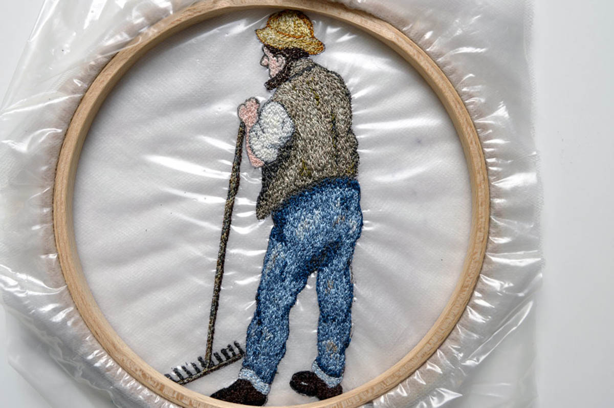
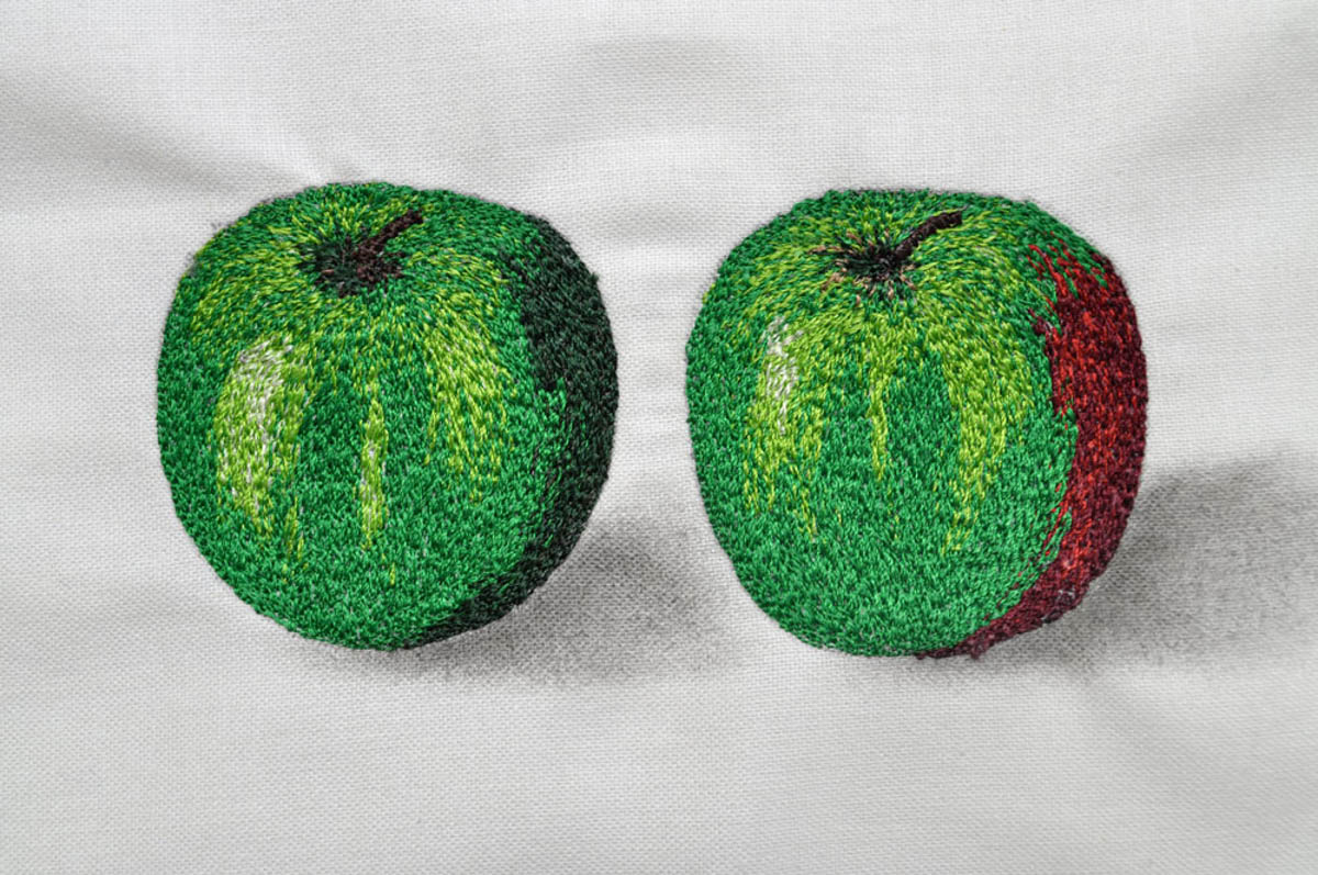
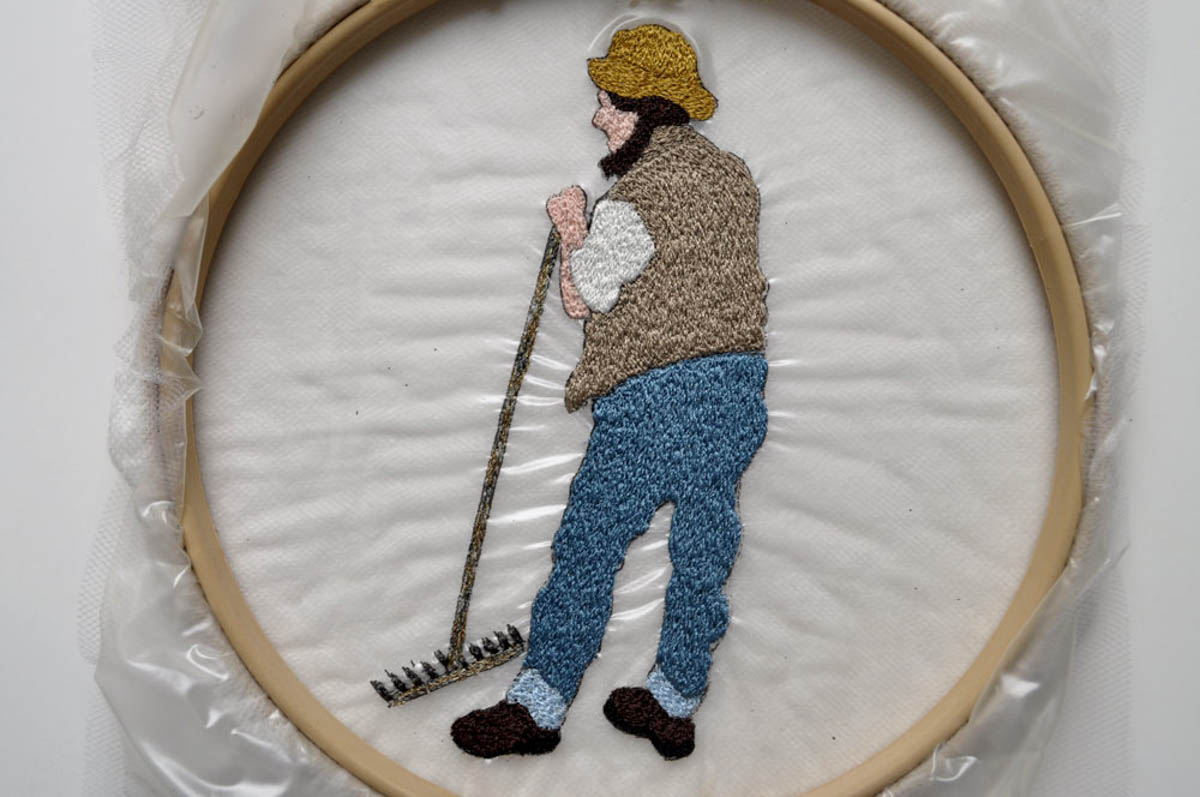
For example, look at the farmer. A dark brown taupe within the taupe color family was used for shading the vest and under his arm, a dark blue for shading the pants, gray for shading the shirt and a dark gold to shade the back of his hat. The shading and a bit of highlighting have been incorporated into the design correctly to give it depth, form and dimension. These in turn give the design its realism. In contrast to the correctly shaded farmer, notice the lack of shading and highlighting in this design.
He appears flat with no shape or depth but more importantly he is completely devoid of interest and realism.
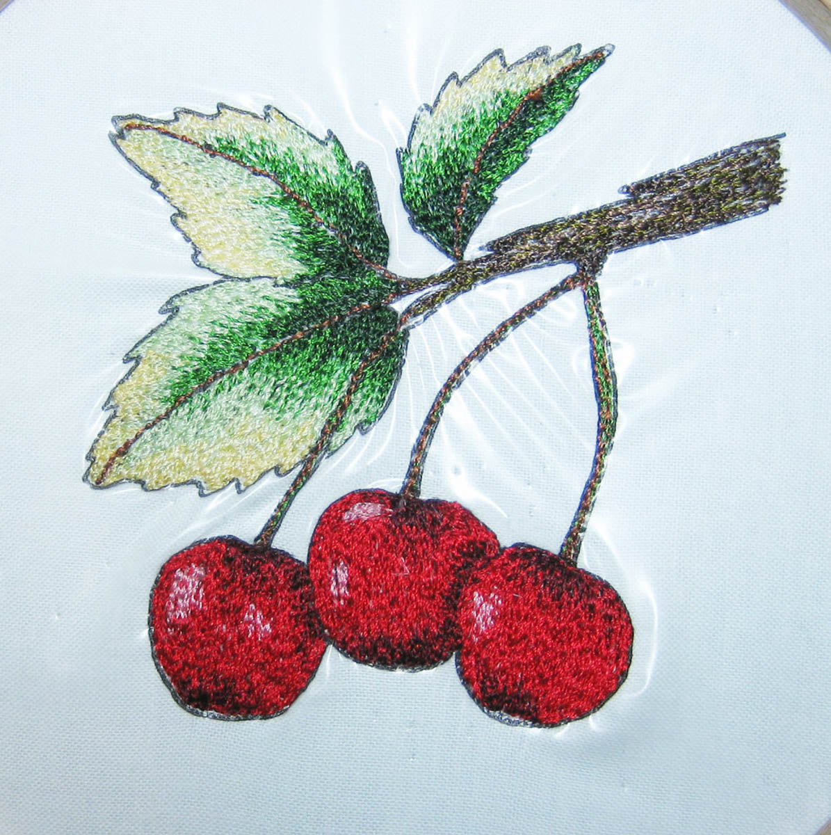
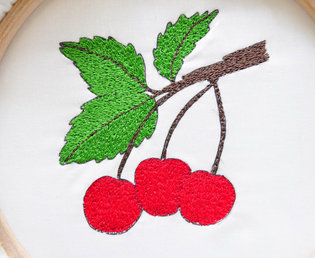
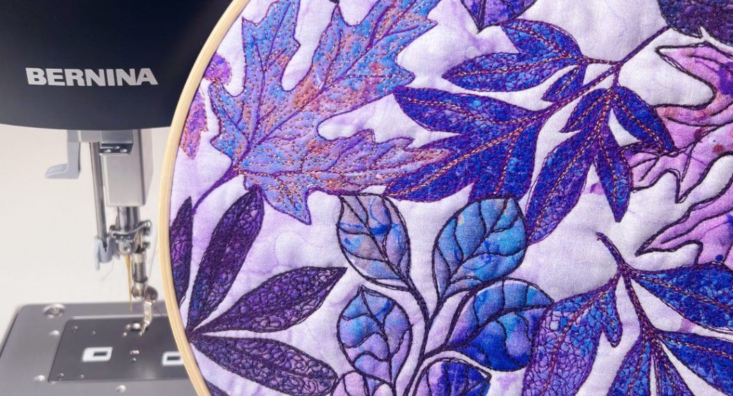
The same is true in Figure 4 where the cherries and leaves appear realistic due to the proper shading and highlighting compared with the same design below.
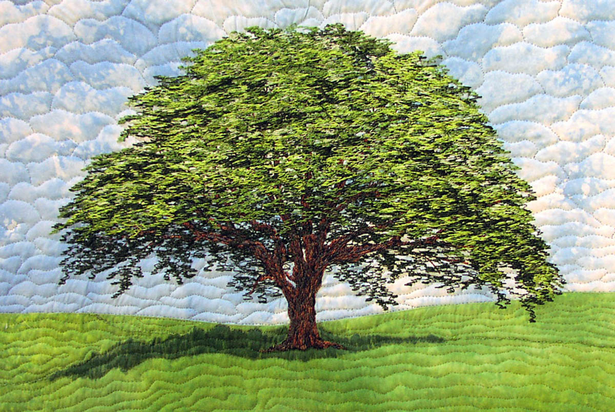
When selecting thread, a lighter value gives the illusion that something is closer to you and a dark value that something is farther away. In thread painting within the large tree design the last thread color was a very bright green to give the illusion that the canopy is closer to the viewer. However, the canopy needed depth so a dark green, was randomly thread painted around the canopy to give the illusion that the viewer is looking right into the canopy.
Nancy Prince is an award winning quilter, international Teacher and Lecturer and Best Selling Author.
What you might also like

4 comments on “Creating Realism with Thread”
-
-
Nancy, Absolutely beautiful! Great work!
I am going to try that on my Bernina. I see that you have the design in the hoop and stabilizer on top of it. I want to learn to paint with thread like that. You have inspired me!
Thank you!
Becky Jo Benson -
Thank you. Informative .May we have more of these tips please.I will now choose my colours carefully for my next project.
-
I am in ah! Thank you so much for the information.
Leave a Reply
You must be logged in to post a comment.

Wonderful article, makes realize why I do not like some designs. So appreciate your time and information..Joann